Restaurant Re-opening in Massachusetts

Restaurant Re-opening

It has been a very, very long “COVID season” and restaurants and hospitality have been some of the industries hit the hardest, particularly in Boston. From large high-end restaurant chains to small neighborhood delis and mom and pop spots, they’ve all felt the pinch. When Massachusetts Gov. Charlie Baker announced that the state would lift all remaining COVID-19 restrictions on May 29, we were all jumping for joy in relief.


The close

Hiddenboston.com keeps a running list of Restaurant Closings and Openings in the Boston Area. You don’t have to be a market analyst to see that the trend of restaurant opening more or less screamed to a screeching halt in March of 2020. Then in June of 2020, the closings outweighed the brave souls that opened in the same month, by more than fivefold.


In Limbo

The “COVID season” has yielded different results for different concepts. Fast casuals that were set up for take-out and delivery have been doing relatively well, if not better during this time. Full-service restaurants have been struggling to stay afloat or even forced to close. One issue the pandemic and the restrictions inevitably brought up was the difficulty some businesses had in communicating with their customers. There were challenges updating them on how they were evolving during this period. In response, many businesses rethought the services they offered to clients, enhanced their marketing and online presence, and expanded their customer communication. While some businesses may have been utilizing more traditional methods, many were forced to adapt to these more high-tech avenues. Rethinking these processes helped businesses to be better prepared for future crises, adapt to the post-COVID world and hopefully help generate larger revenue down the road. Using more current systems can also help businesses gather more data and develop their products and services around it.


The Pivot

One of the most positive aspects of the pandemic has been to see so many individuals and groups working together and supporting one another. The restrictions caused the restaurant dining experience as we know it to change. Under the new circumstances, it was necessary to rethink the dining experience and find innovative ways to bring it outside of their typical mode of operation. Restaurants were prompted to come up with creative and innovative ideas, partnerships, offerings, experiences, and focused on establishing authentic communication with their customers as a result. As they say, necessity is the mother of invention, and the restaurants were proof of that during the heath crisis.  Even the smallest details can have a large impact. Many restaurants offered to-go meal kits, cocktail kits, zoom classes showing how to prepare their most popular dishes, or other unique ways to engage and interact with the customers while they could not dine-in. Being honest, staying true to their mission and showing care for their employees, customers, community and even their competitors helped keep many restaurants alive, and even thriving.


The Re-open

In October of 2020, the restaurant closings-to-openings ratio once again started to shift toward ratios similar to the pre-COVID era, albeit not as abundant. Restaurant operators started to see hope. If the dining trends prior to May 29th 2021 were any indication of what was to come, we had a proof of concept that diners will be back, many vaccinated and ready to get back to the way things used to be. A stroll down Newbury Street reveals packed and extended patios.


The Problem

Aside from the quoted hour and forty-five minute wait to get a seat at a restaurant in the Seaport, if you can manage to get even that, the biggest problems have been both the long list of restaurants that are no longer an option, and finding help to operate the remaining restaurants at full capacity. People are just not eager to get back into the workforce. Some 3,400 dining establishments have yet to re-open post COVID, and yet there is still a shortage of people interviewing and taking restaurant positions. An apparently evident reason for this is just that the unemployment benefits are higher than the hourly wages. There are many Boston area operators that are working to change this through a “kitchen appreciation charge” and other means. Also, the pandemic left many employees, who had been forced out of work, to reevaluate their former work situations. Workers across the spectrum have used this crisis to reevaluate their career choices, seeking new option.


Recovery

Baker said that he will lift the state of emergency, which has been in place since March 10, 2020, by June 15. The Massachusetts Restaurant Association has been a great source of information and aid to the restaurant community before and during this crisis.  And undoubtedly will be a resource far after the pandemic resides. The MRA has resources for restaurant recovery and sources for grants to assist in restaurant recovery, including information to sources for shuttered restaurants and toolkits for reopening.


Support your local, and not-so-local foodservice and hospitality establishment. Make reservations, stay safe and enjoy dining out in Massachusetts again!

 

Historic Preservation in Architecture

Historic Preservation in Architecture

Historic preservation often defines the process of conserving, reusing, protecting, or enhancing buildings or sites of historical significance. It provides an appreciation of local or national history and acts as a physical link to the past. Additionally, historic buildings can add more character and prominence to an area and stand out next to modern buildings.

What makes a building Historic?

When working on a historic project, the first step is to do the appropriate research to determine what makes the building historic. Some questions or considerations that may help:

·         When was it built?

·         How was it built and what materials were used?

·         What style is it and what are the most important and defining architectural features, finishes and characteristics of that style?

·         What condition is it in?

·         What was the building previously used as and has it previously been modified or adapted?

·         Where is it located and how is it significant to the surrounding neighborhood or area?

·         Are there any existing plans or existing essential structural information?

The next step is striking a balance between maintaining the integrity of the building while adapting it to fit a new program and current zoning and safety codes. The building must have updated systems to accommodate modern technologies and equipment, and address life safety and security issues. Reinforcing any existing structure and making sure the building is protected against any natural disasters is also essential. When possible, architects should try to make the building accessible, which can be a challenge in historic buildings. Based on jurisdiction the historic review can take some time for approval. It is important to talk to your architect early to determine what is required for approval and what changes may not be suitable.

Our projects

The Crown

Restaurant in Manchester, NH

Awarded Historic Preservation Award by the Manchester Historic Association, in 2018

“Never forget where you came from, and never forget where you came to eat” -Owner of The Crown

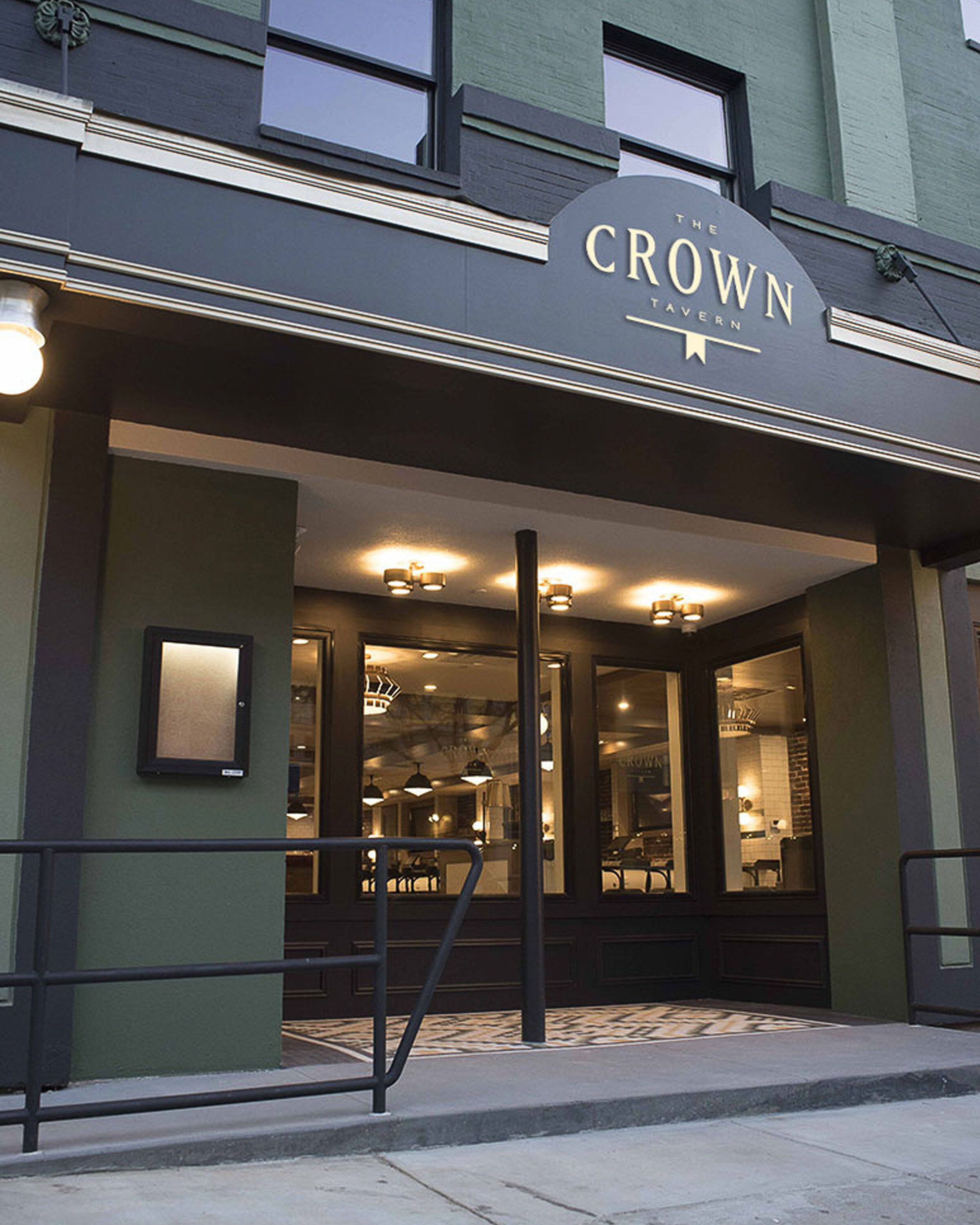
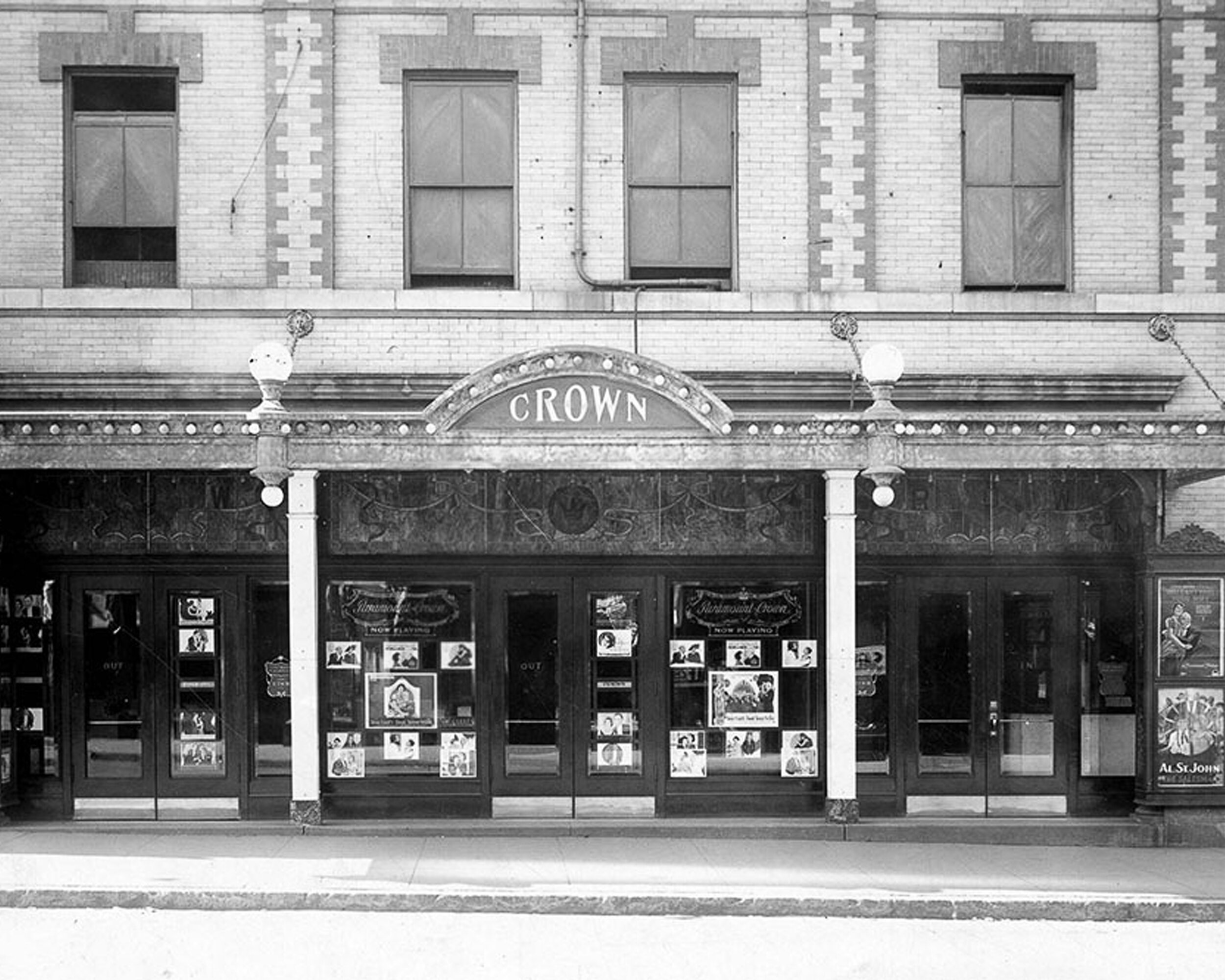
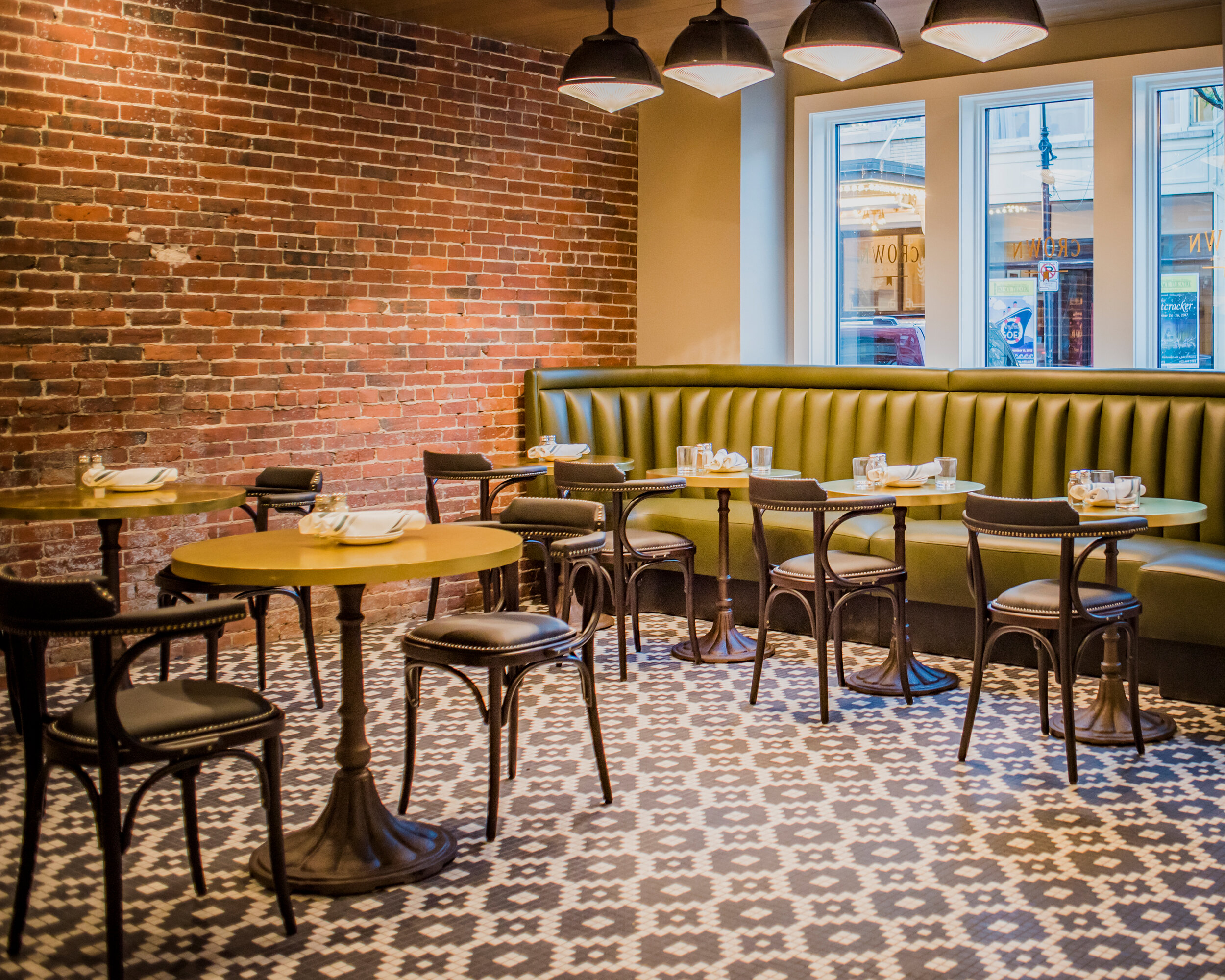
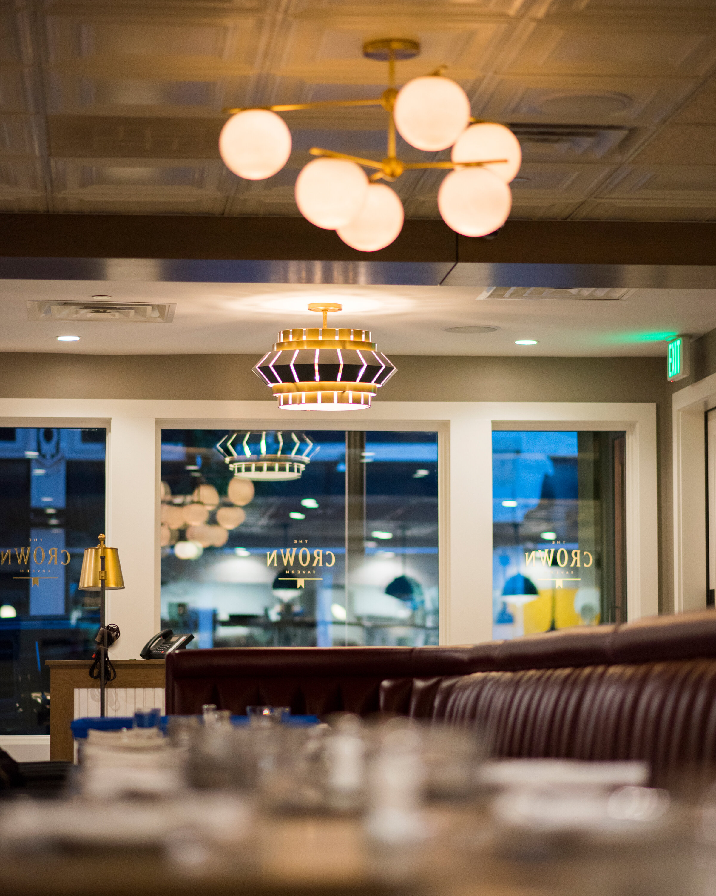
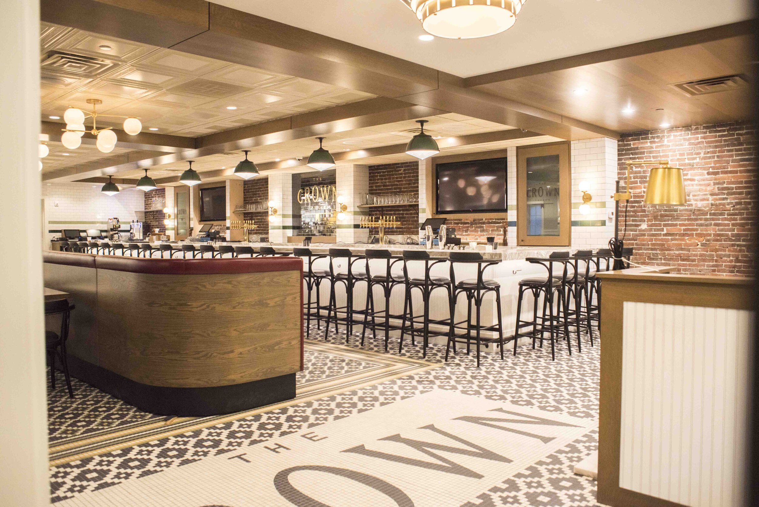
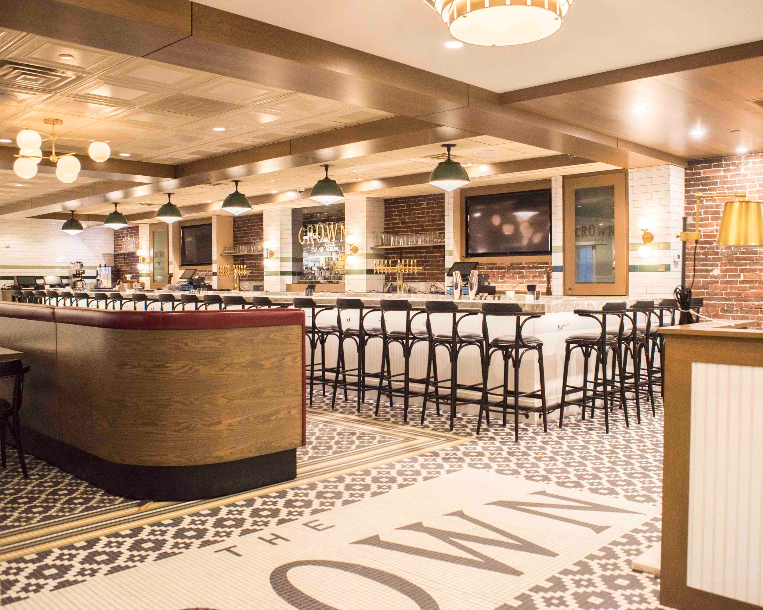
One project McMahon architects was able to bring back to life is The Crown in Manchester, New Hampshire. This area was once home to the city’s premier movie theaters, and this past-to-present restaurant concept is located inside what was once a silent movie theater. After the theater closed in 1961 several businesses rotated in and out of the building, but the memories of the past remained. In September 2017, the locale opened its doors as a restaurant using the original movie theater name, ‘The Crown’. The moniker was, and still is a nod to Manchester’s longstanding and still used nickname, the ‘Queen City’. Open to the sidewalk and guiding the guests in, is a bold geometric tiled floor, beneath the original theater marquee, which was rebuilt with glowing light globes on each corner of the steel overhang and lines of Edison light bulbs outlining the edges. In the center of the marquee is The Crown logo just as it was from the original theater.


Mixed Use Building

Boston, MA

Awarded Historic Preservation Achievement by the Boston Preservation Alliance in 2018

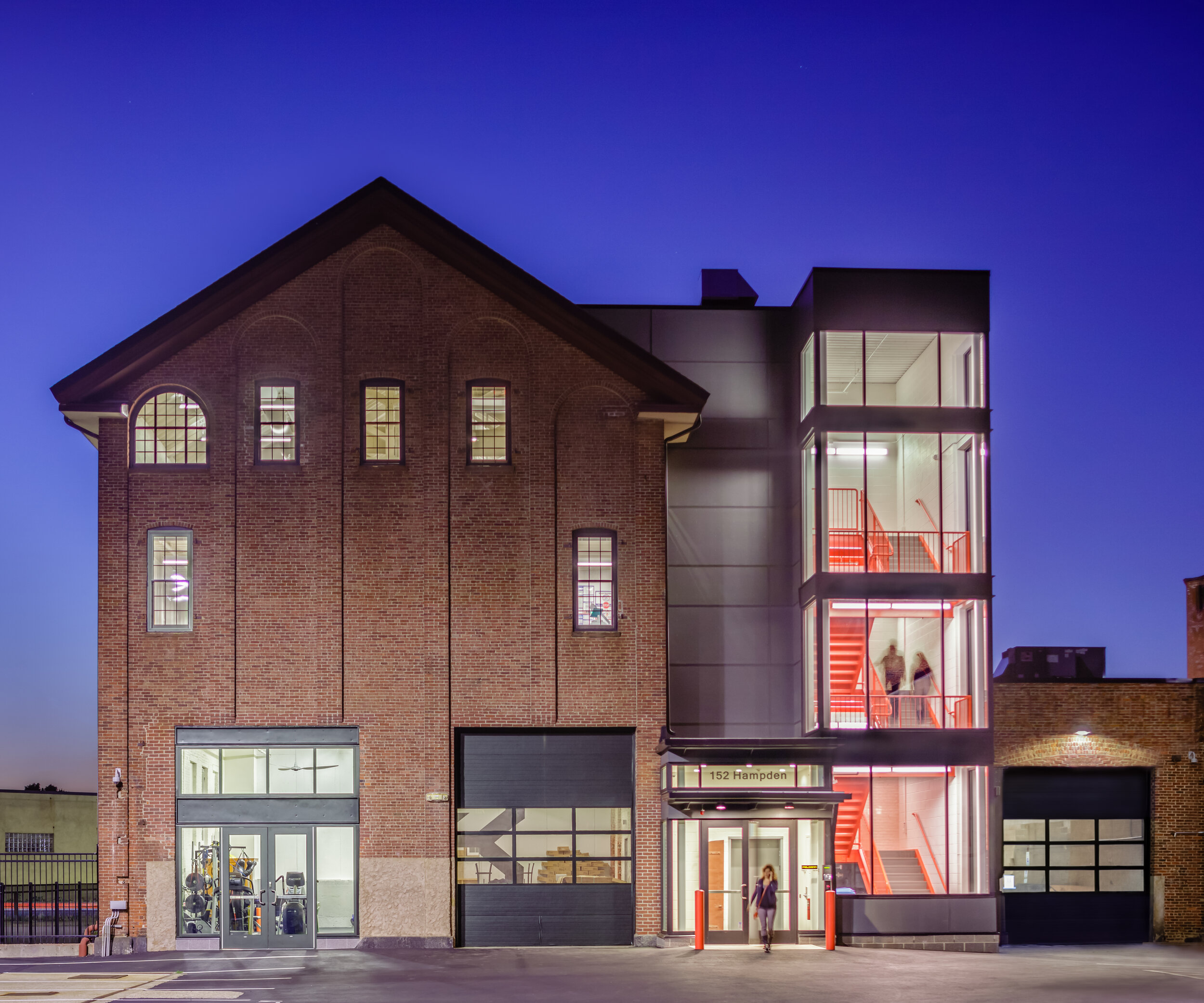
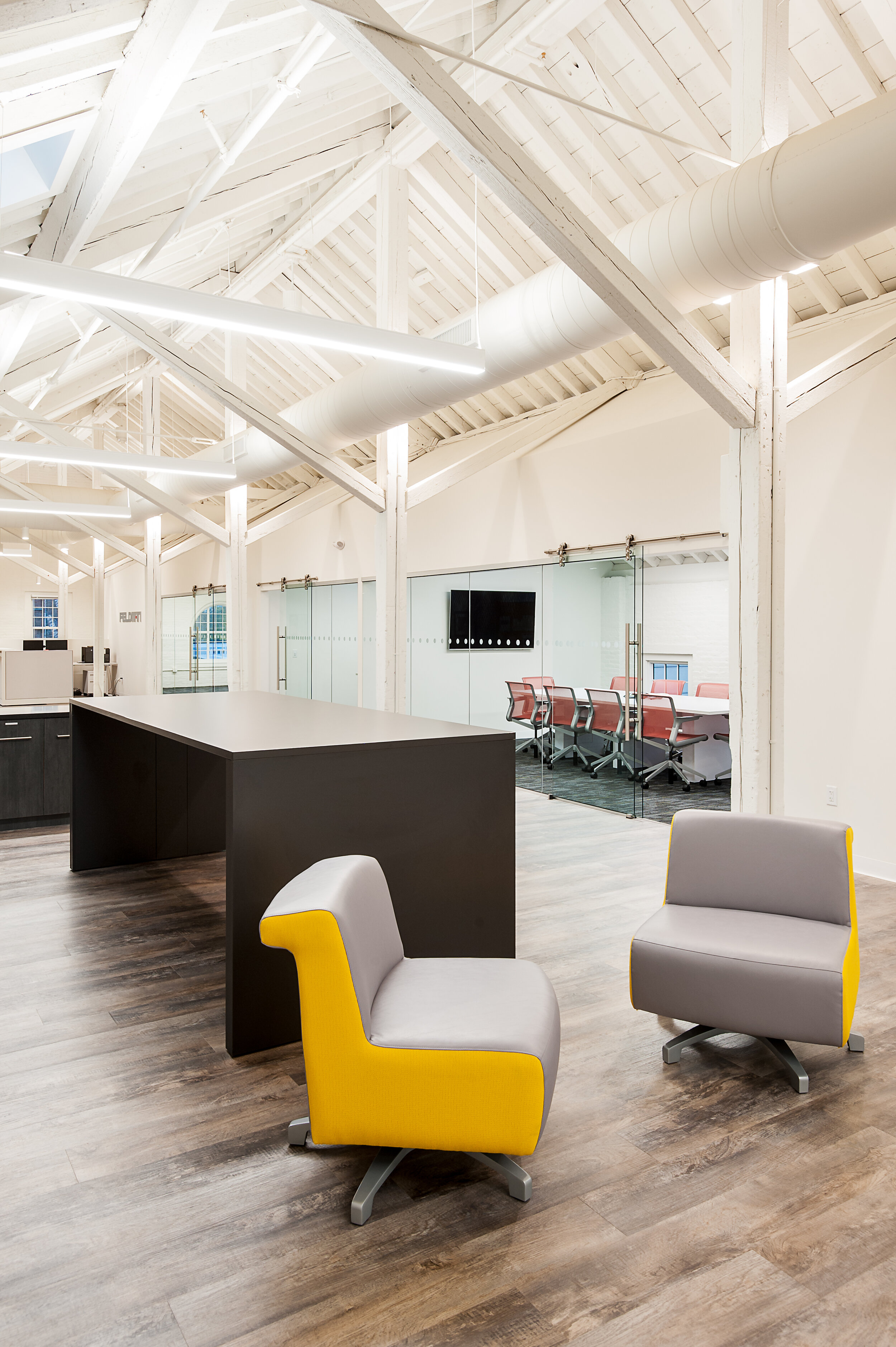
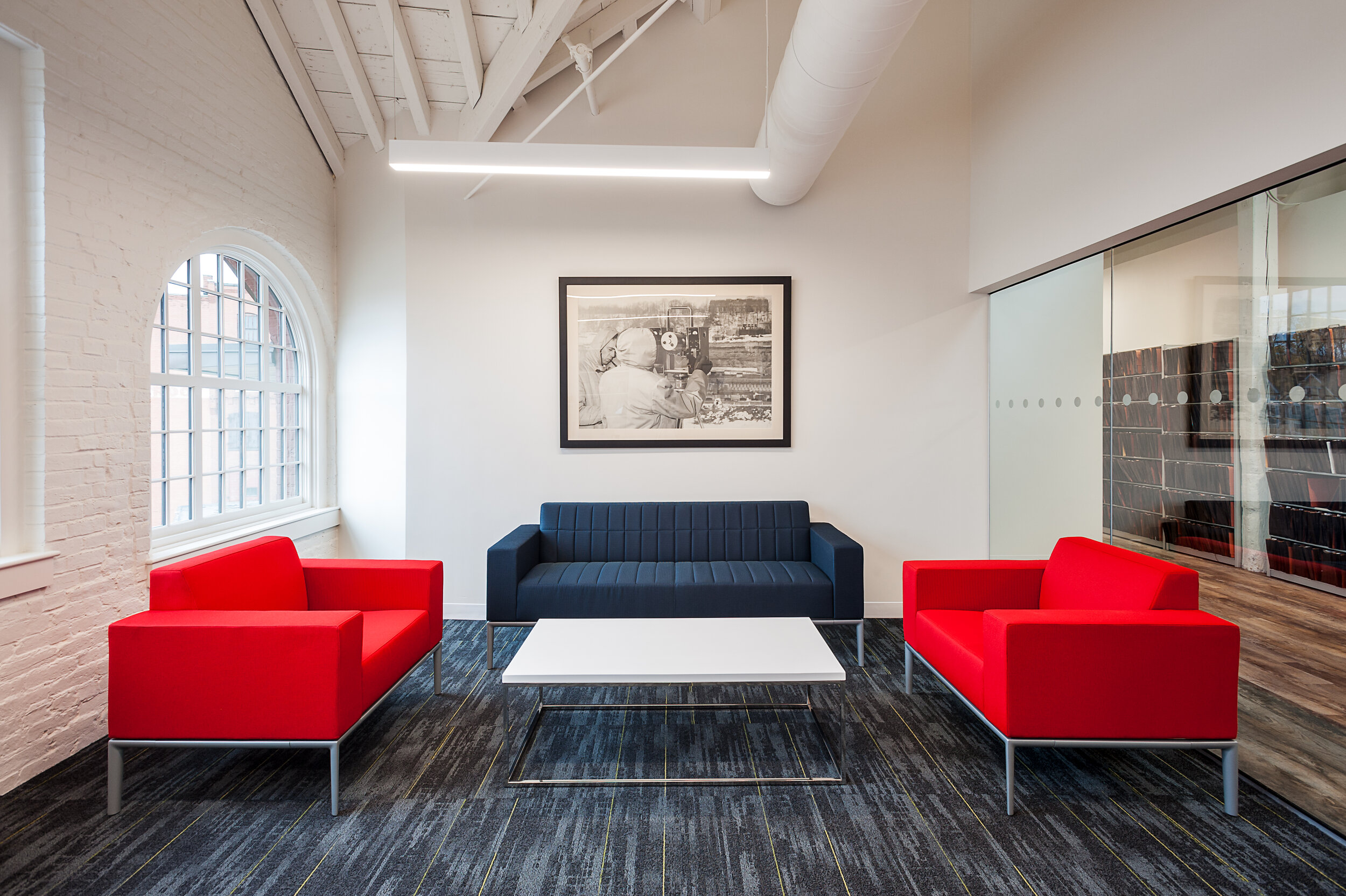
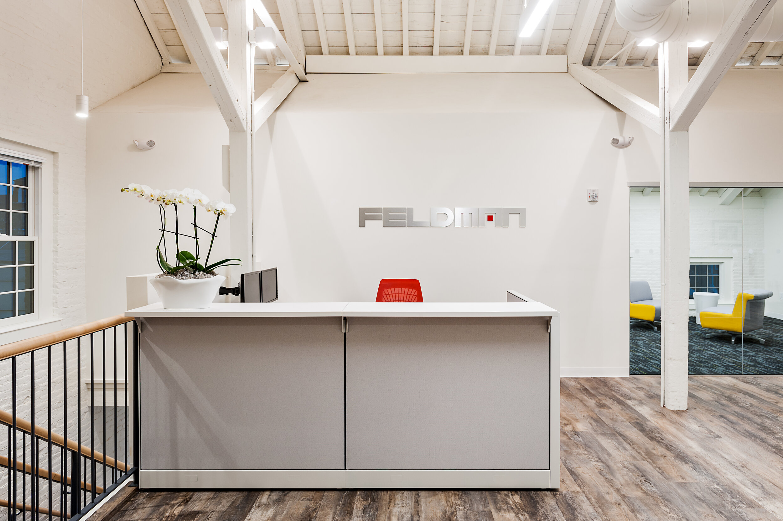
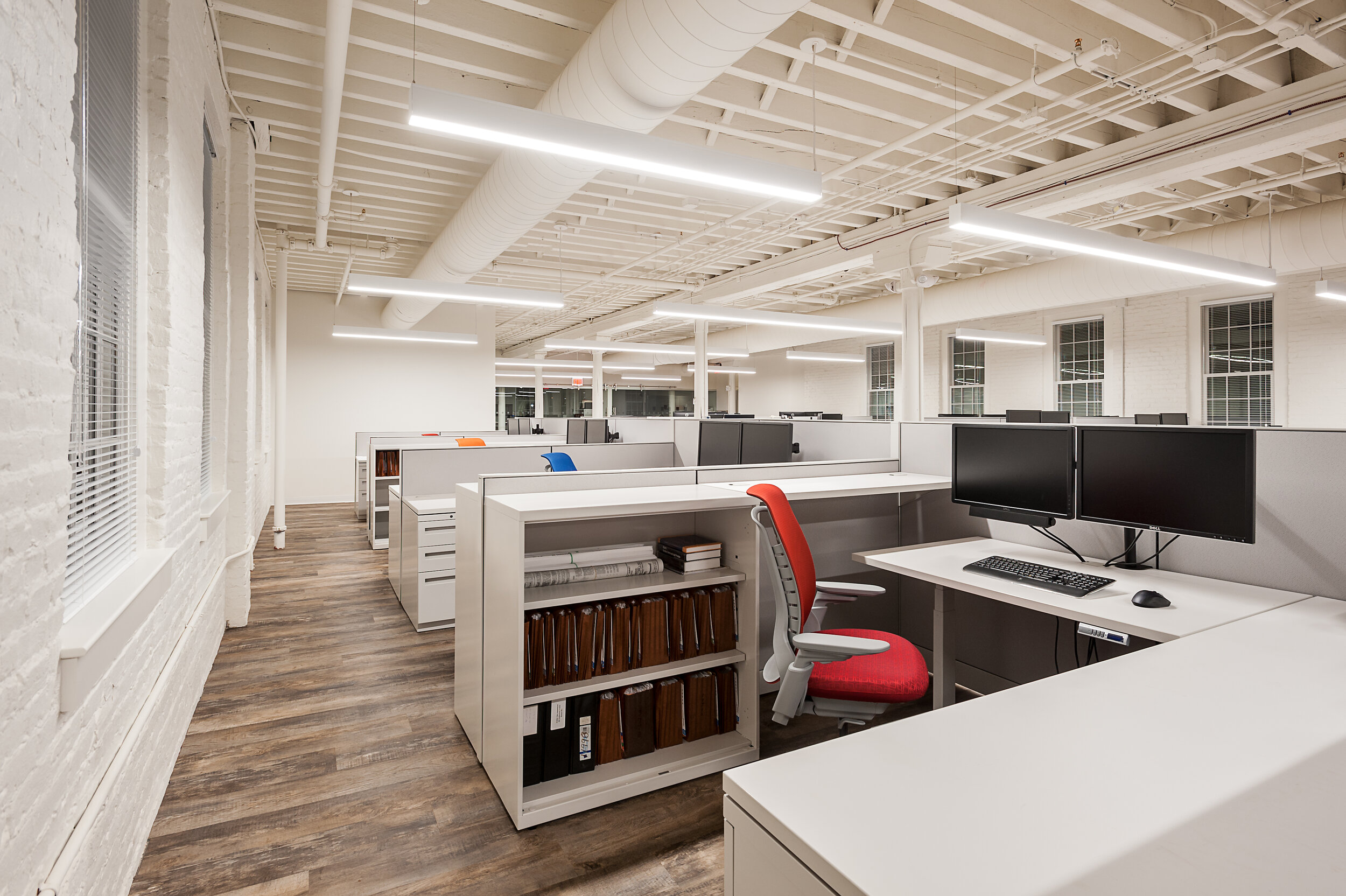
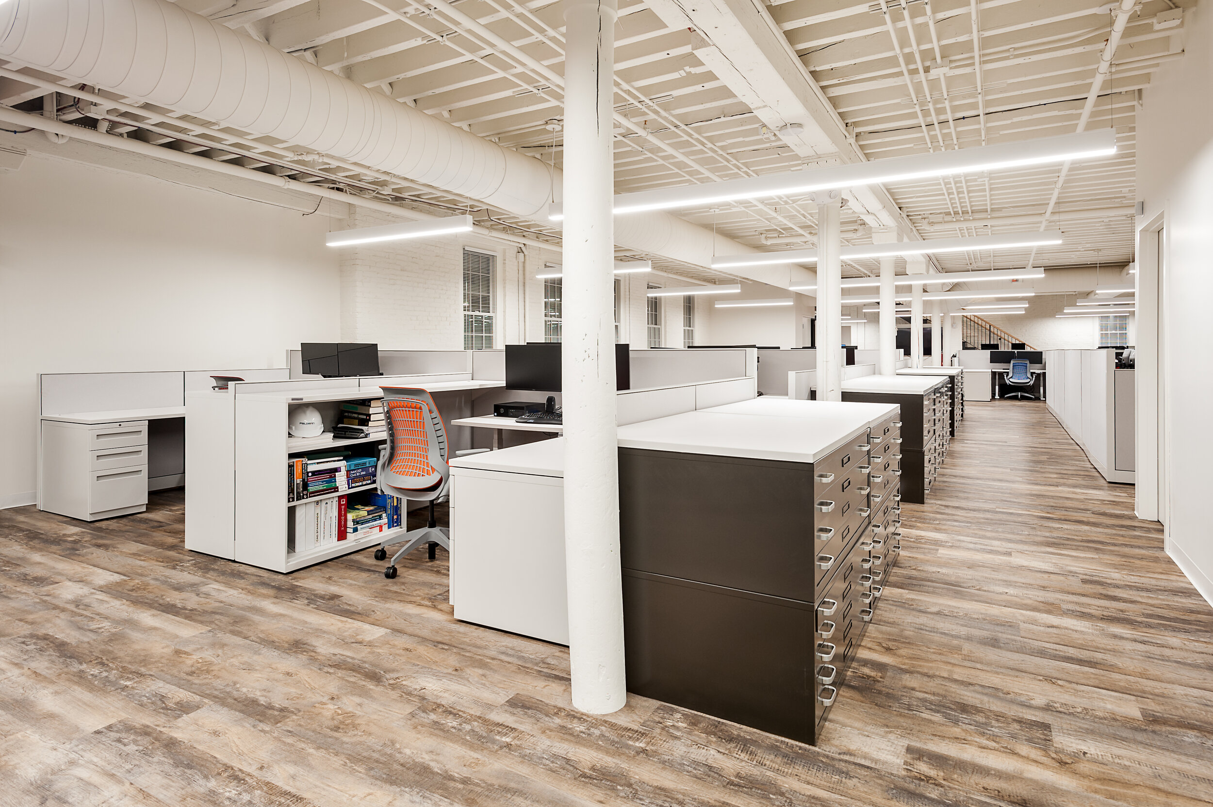
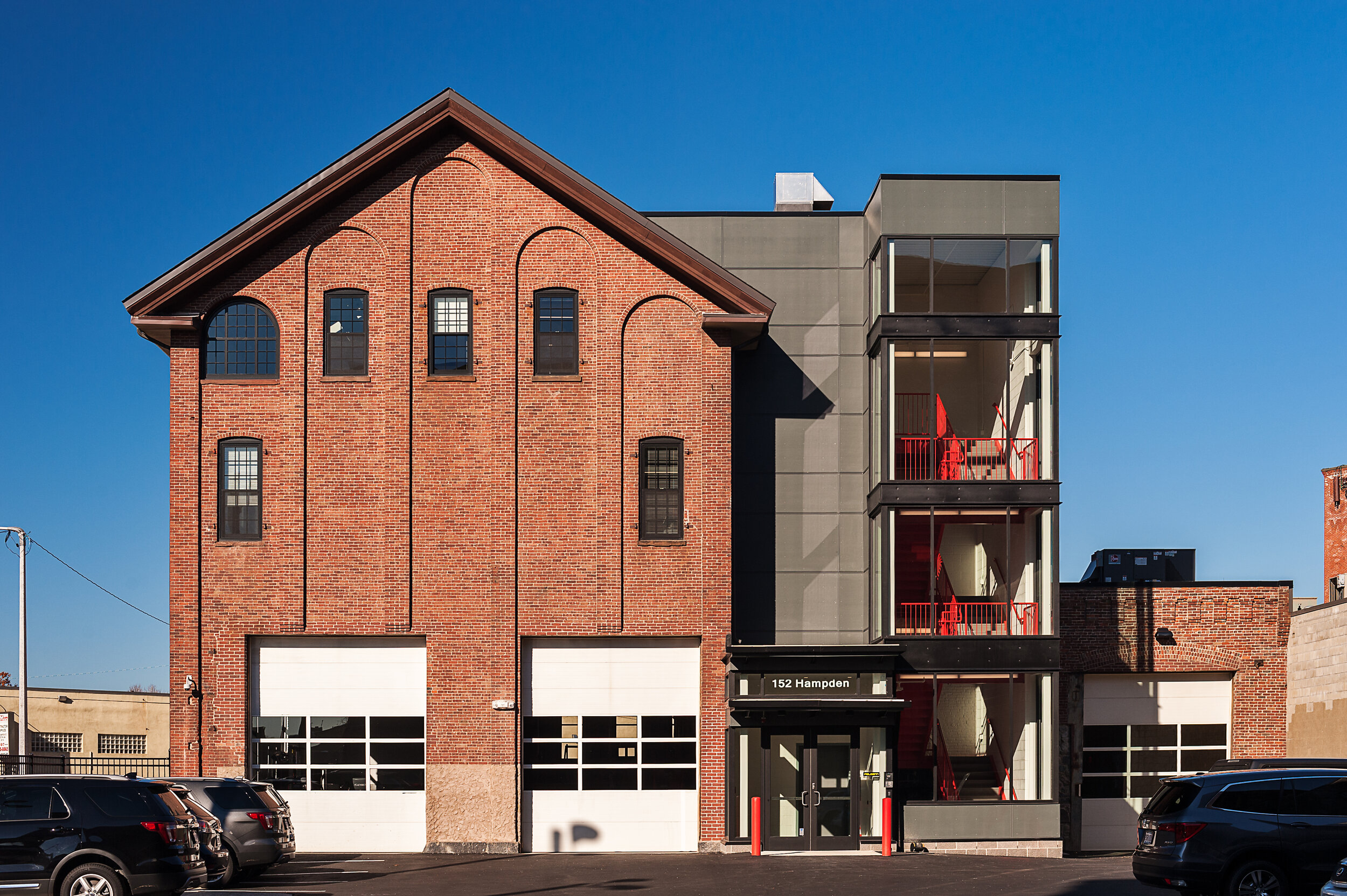
Another unique preservation project is the building at 125 Hampden street. In the 1860s this building was originally a machine shop. Serving many purposes throughout its lifetime, from a piano factory in the 1880s to an antique car and bicycle storage facility. It now serves as a corporate workplace and was recently the home to a brewery. The building itself has a strong base and is comprised of brick walls and wooden beam structural elements, which have been left exposed and painted white, in order to highlight and lighten up the existing rough yet durable materials. The 3rd floor was designed to emphasize the original construction, as well as the cathedral ceiling. To bring additional light into the space, original window penetrations were reopened, and skylights were added to the roof. One of the most drastic changes made to the exterior was the addition of a vestibule containing the elevator and stairs. The expanse of windows and engineered factory finished construction panels create a modern addition that contrasts the original 1800s structure. This modern addition addresses life safety codes and reflects occupants’ current needs but still complements the industrial nature of the historic structure.

Workplace Break rooms and Kitchenettes

Workplace Break rooms and Kitchenettes

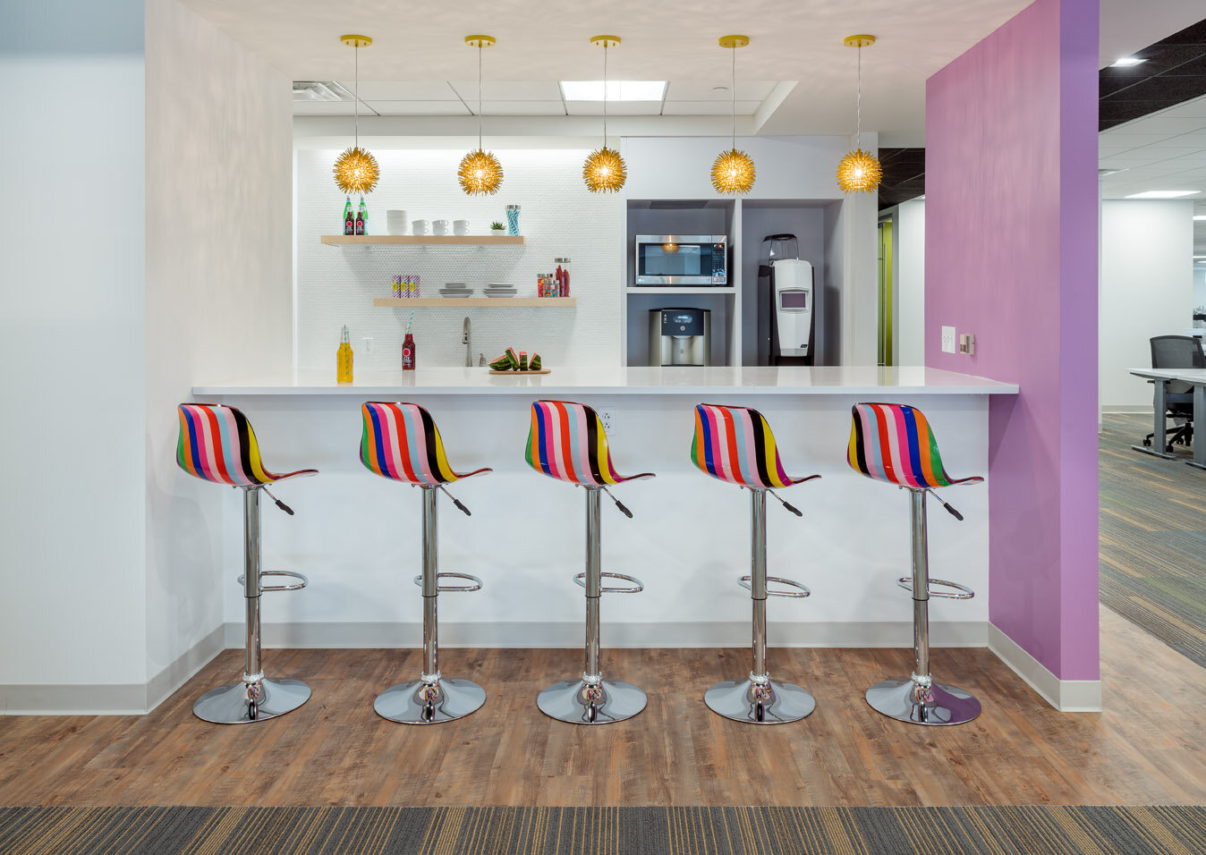
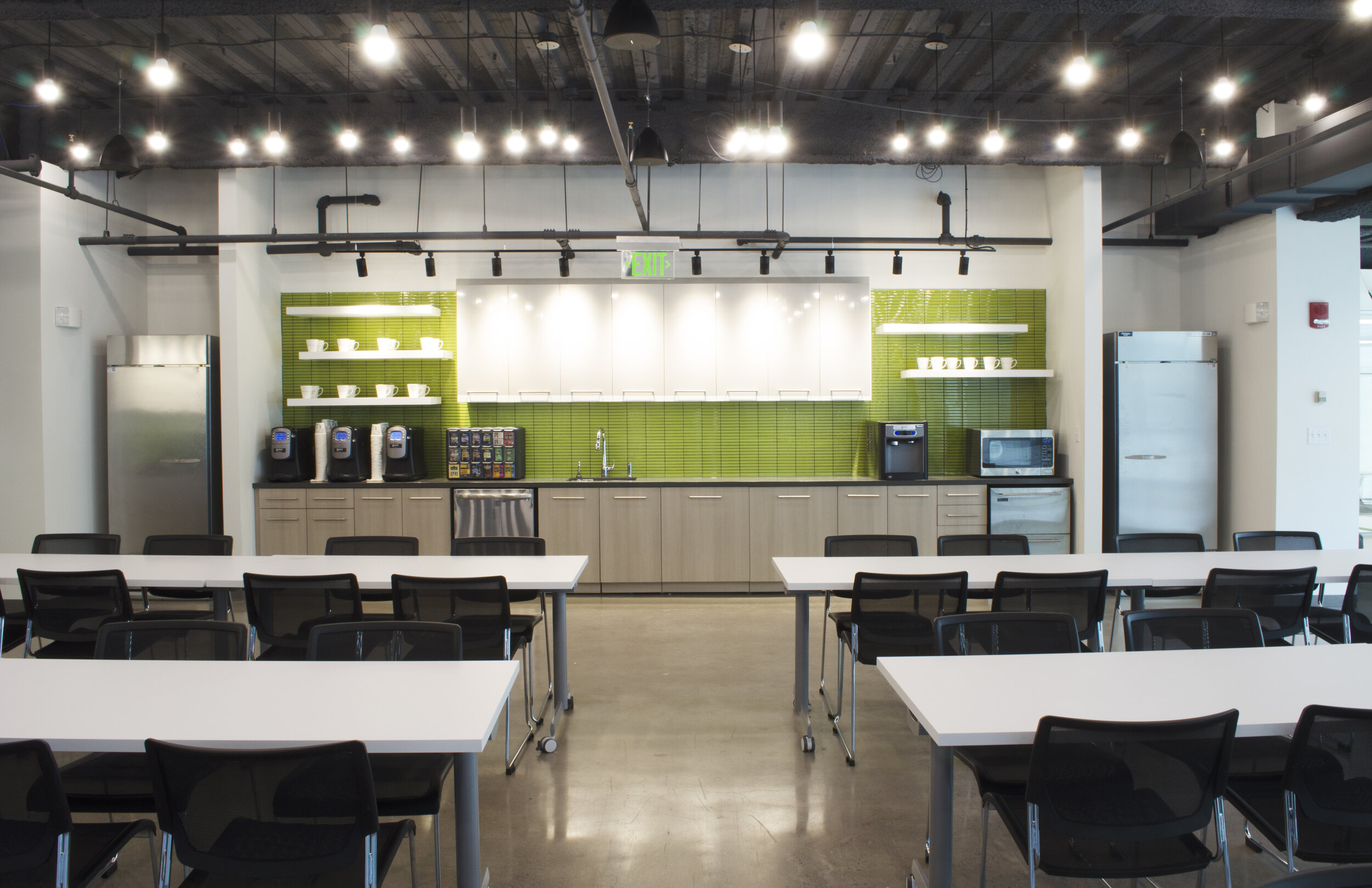
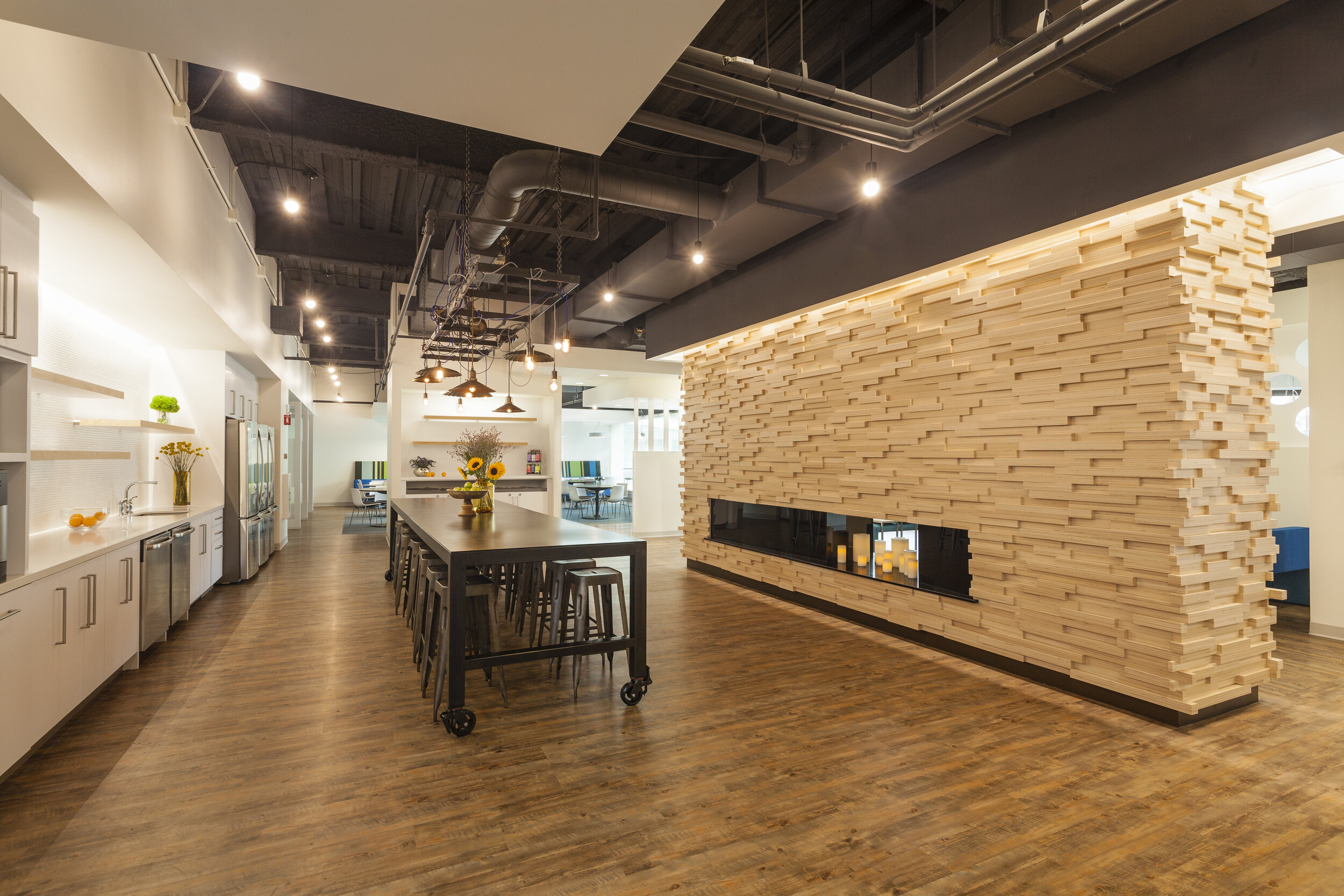
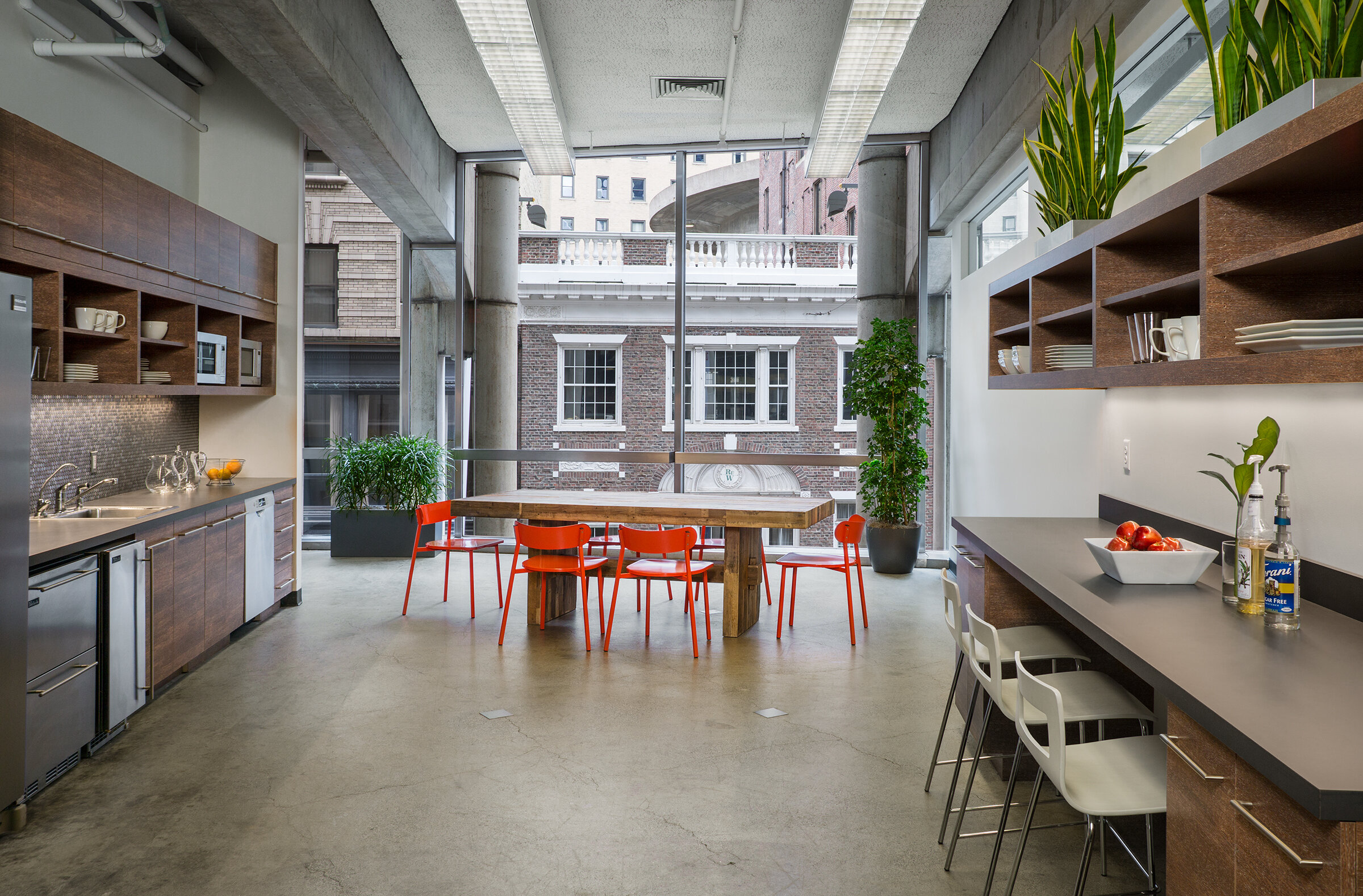
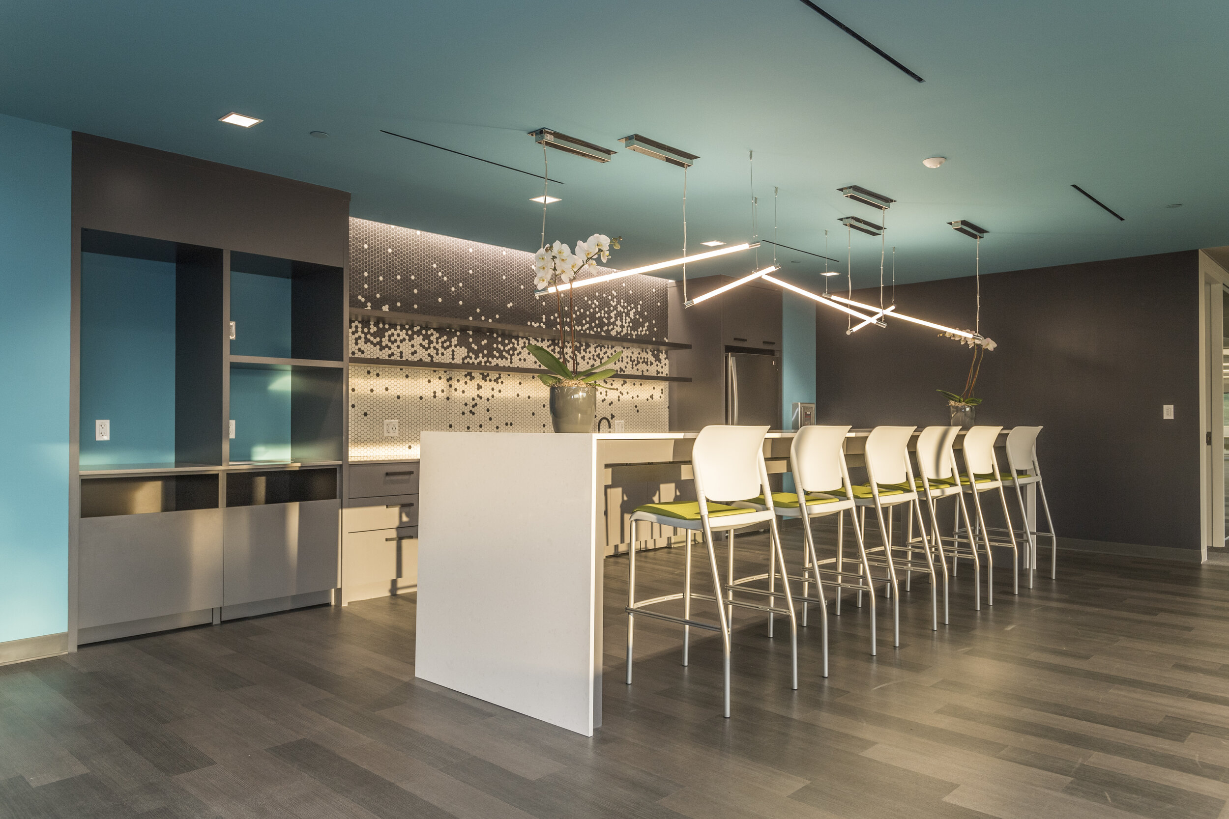
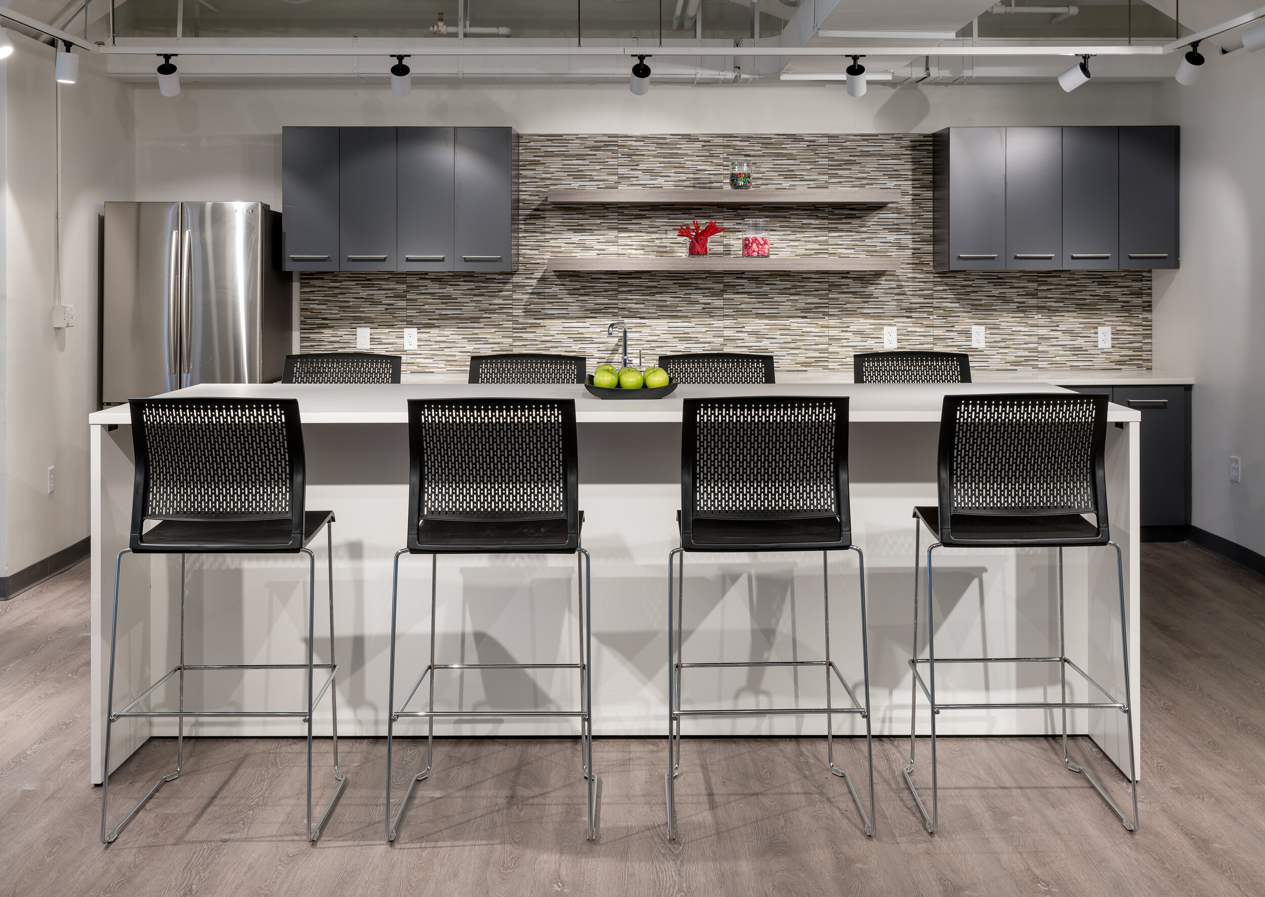
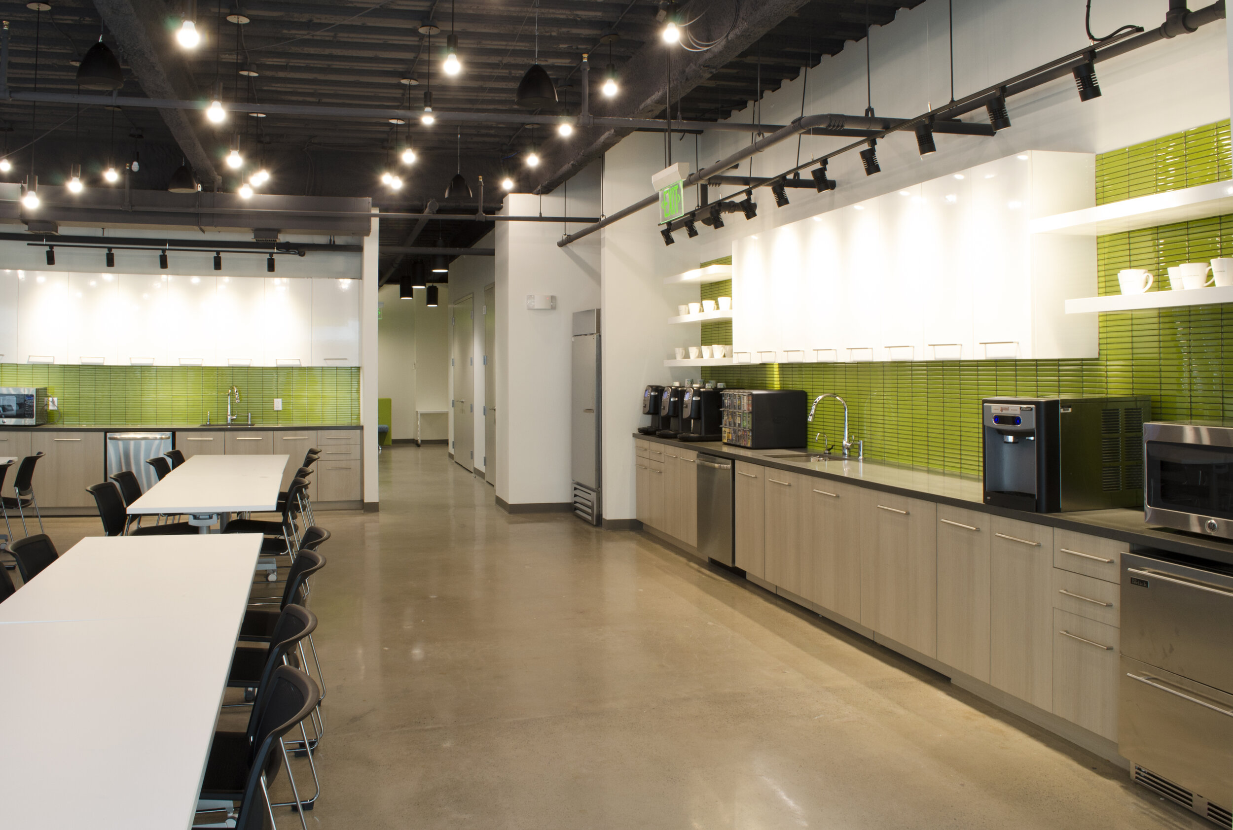
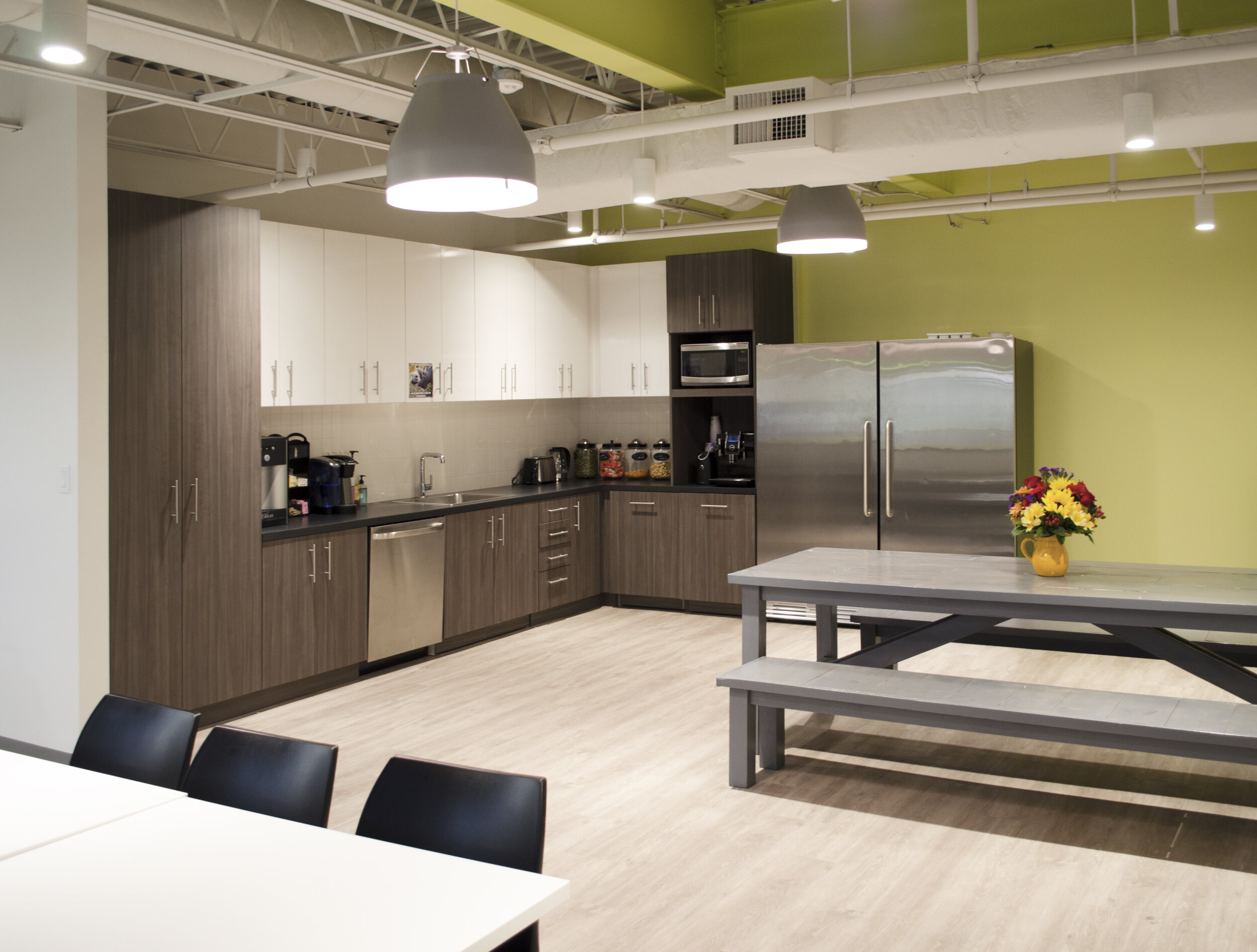
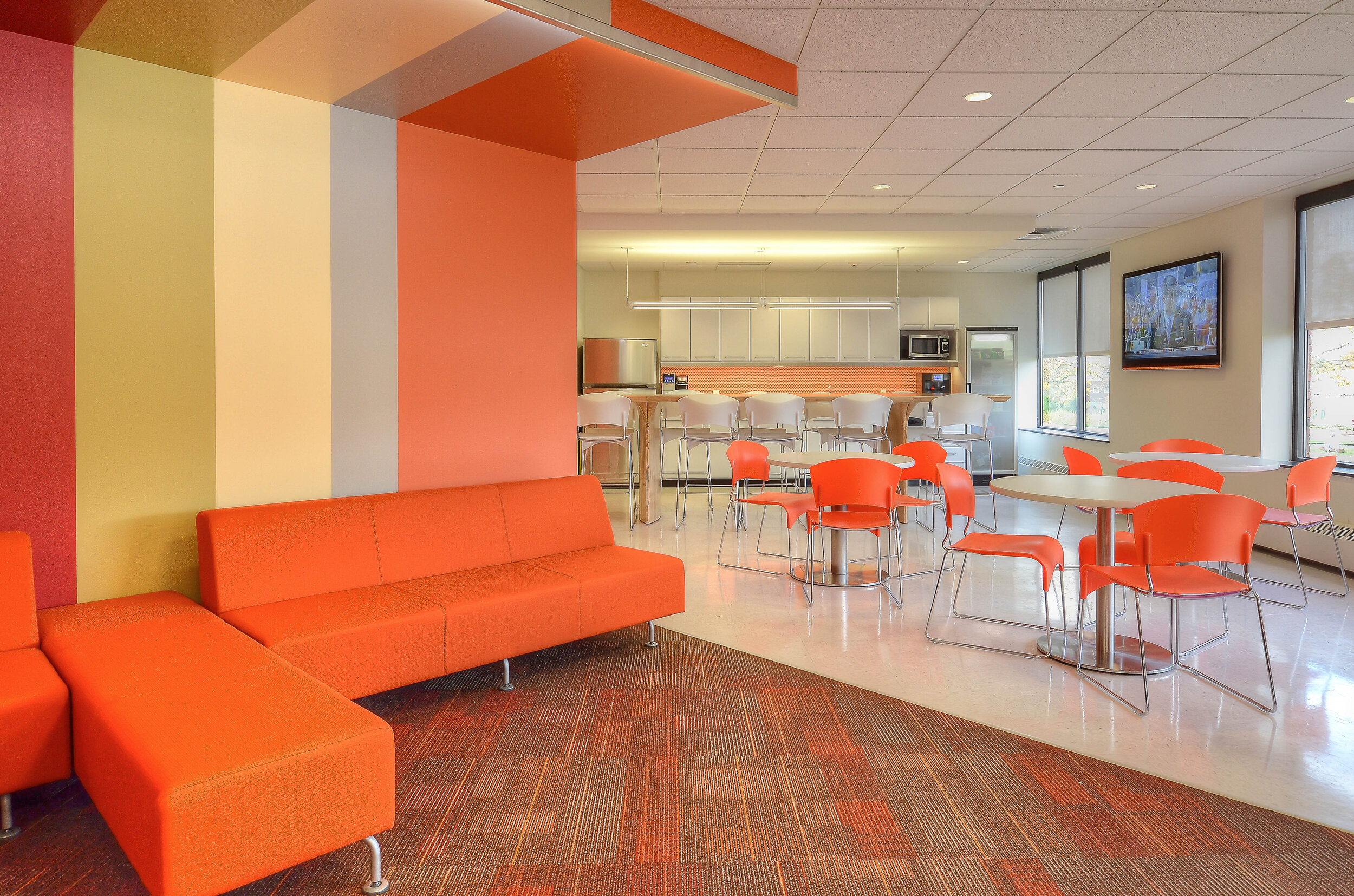
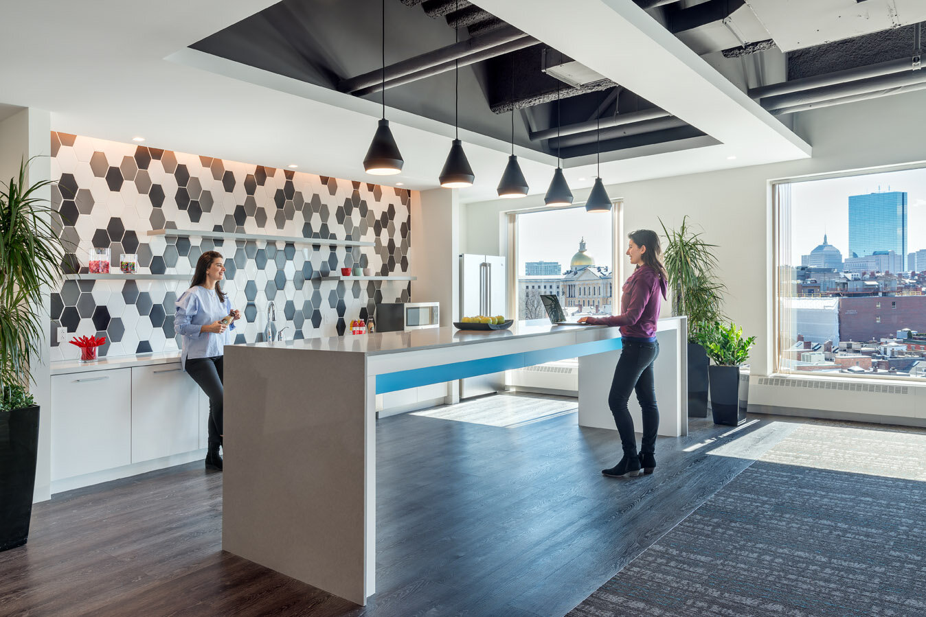
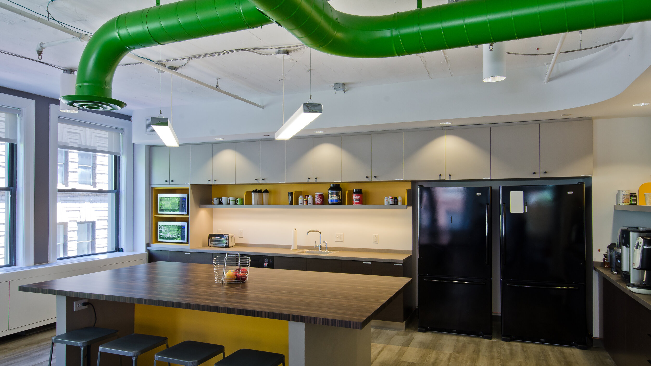
When the word “office breakroom” is mentioned, most think of a small room in the back of the office, with the bare minimum equipment needed to grab a drink of water or coffee and reheat food from home, and hidden far away from guests as it is typically messy or not the most aesthetically pleasing. In contrast, a kitchen in a home is considered one of the most important spaces, and as discussed in our previous blog post the “hub” for so many daily activities. It is also extremely important when it comes to the value of the home. The importance of a residential kitchen has recently influenced the perspective of office break rooms and kitchenettes. Over the last decade, workplace kitchens have increasingly become a significant part of the office. No longer hidden, they are moving towards the forefront of the workplace.

Looking at current or updated office space designs, we often see the kitchen now at the front, acting as an energizing extension of the office space. The placement and design of the kitchen can reflect how the company interacts and its culture. While the kitchen does not always have to be front and center, the placement and layout of it within the office should encourage people between different departments to interact. This encourages employees that typically do not interact regularly on a day-to-day basis to exchange ideas and thoughts. New interactions lead the company in having a stronger bond, and subsequently communicating even better during projects. Therefore, the break area should also be a comfortable and inviting space, to encourage conversations while also being a space for employees to take a necessary break. It can also be used as informal meeting space for companywide presentations, or for teams to collaborate and share ideas.

A well-designed kitchenette or break room encourages employees to stay at the office to take their lunch breaks, thus interacting with each other more often. It also helps increase productivity, employees’ energy levels, focus, and their overall happiness and satisfaction. Having a comfortable space to take a quick break and recharge from a desk and screen can make a big difference in an employees’ day.

Design a successful break room or kitchenette

It always helps if a design is appealing to the eye, but there is much more that goes into it to make it functional and efficient. Making the kitchen/breakroom the “hub” of the office does not necessarily mean it has to be a big open space in the middle of the workplace. It can be placed in a location that is easily accessible by everyone, but it can also be somewhat closed off to prevent noise and scents from traveling throughout the rest of the office. Fun partitions or acoustical barriers can be used to create separation. As in any space, sufficient lighting is also crucial. When selecting finishes and cabinetry, it is worth investing in resistant and durable options, as this space will be used by more people than a typical residential kitchen and will prevent the need for constant repairs or replacements. It is also important to offer employees the necessary products and appliances, so that everyone can contribute to keeping the kitchen clean. Providing a large dishwasher, cleaning supplies, sufficient sink space and ample trash and recycling helps prevent any unwanted mess or health hazards.

To make the kitchenette a multifunctional space, it is also a great idea to provide comfortable and durable furniture, with a variety of seating types. Providing employees with all the needed utensils, a variety of plates and bowls, and storage space is also a great way to ensure everything needed is stocked in the kitchen. It is also important to provide water, preferably a hot and cold water dispenser to save time when grabbing a hot cup of tea, and of course, coffee! If there is allowance for it, providing healthy snacks or beverages is another great way to provide a quick pick-me-up for employees, while also helping them feel appreciated. According to research by Fruitful Office, by just offering fresh fruit to staff, productivity can be increased by more than 10% and employees can feel more valued and healthier!


When considering a kitchenette or breakroom always consider your employees needs and how to best integrate this space into your office. McMahon Architects is always working with our clients to ensure the health, happiness and productivity of employees is expressed throughout the design, including a well thought out and executed break room or kitchenette.

Residential Kitchen Design

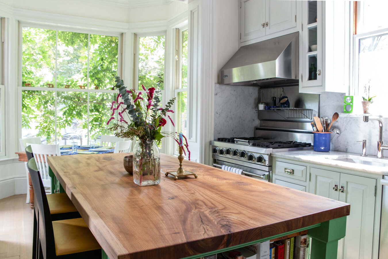
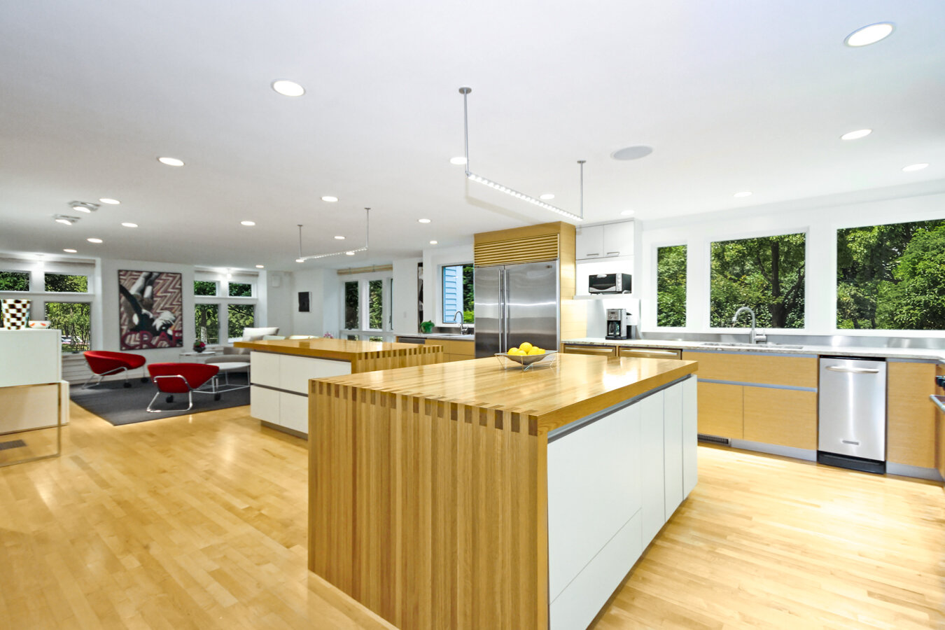
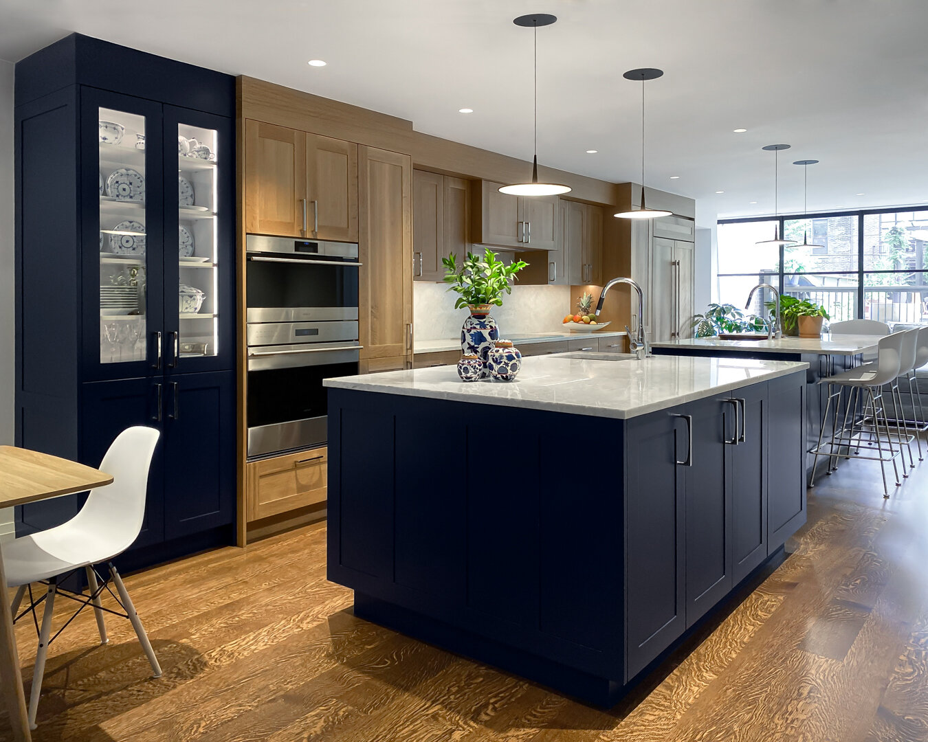
The kitchen is the new heart of the home. It is the space where people eat, gather, work, entertain, and much more. With it being so important in our lives, the layout must be as efficient, comfortable, and visually pleasing as possible. Beautiful finishes and appliances are important, but they are only one small part of the design. Below are some golden rules that we use to design safe & smart kitchens that work for our clients.

Where do I start?

A good place to start is by locating the plumbing location if it is an existing space, or deciding where it will go if it is new construction. The plumbing and therefore location of the sink will help determine the layout of the rest of the space.

How do I lay out the rest of the space?

To create the most efficient layout and understand how the kitchen will be used, it is helpful to create “zones” within the space. Below are some general areas or “zones” we can break the kitchen into:

  • Cleaning area: sink and dishwasher

  • Prep area: large counter space, sink/trash for food prep

  • Cooking area: stovetop and oven

  • Pantry area: refrigerator, dry food storage

  • Storage area: flatware, utensils, Tupperware, cookware, smaller appliances

It is most efficient to try and keep cabinets and appliances within the same zone in the same area. Lesser used items such as fine china can be placed higher up where it is harder to reach daily. Another important step when planning for storage is to measure and size the storage according to the specific items being stored. That way everything will have its own place and will not need to be crammed into a different location. Utilizing corner spaces and planning to store items in single layers so visibility is not obstructed is also important, that way nothing stored is “forgotten” in the back of a shelf.

While planning for storage and cabinetry, it is also helpful to use standard dimensions. If that is not possible, try to keep repetitive dimensions within the space. This reduced oddly shaped or vacant areas, and the kitchen looks uniform and balanced.  Additionally, work surfaces should not be broken up or separated by tall cabinets or appliances. Ideally, full-height fixtures should be placed on the ends of the workspace, as that creates balance and an anchor at the ends, rather than interrupting a needed workspace.

Another important aspect to think about is doorways and door openings. Doorways should not interfere with appliances or cabinets. It is best to plan for larger passageways if possible, with a minimum of 42” to 48” in work areas. It is also best to keep the appliances 4-9' apart, with no heavy traffic passing through that area. Appliance and cabinet openings should also not interfere with each other. There should be enough space to freely open any doors. An efficient kitchen should be intuitive to use, regardless of who is working in it or what they are using it for.

Account for standards

In addition to plumbing and appliances, there are also standard dimensions and clearances to consider.

Standard kitchen counter depth is 24-25”, with a minimum of 15” above to the upper cabinets or shelving, to accommodate for any appliances or workspace that will go below. We also recommend that a 30” wide continuous counter space be included somewhere in the kitchen for primary prep. Additionally, when ordering or specifying countertops, it is best to have clipped or rounded corners, so that sharp edges aren’t a hazard to bump into.

Typically, the cooktop should have a 12" minimum landing on one side and 15" on the other. It should also have good ventilation, with 24" clearance above if there is a noncombustible surface above it, or 30" if decorative. It should not be placed under an operable window. For safety reasons, it is also good to include a fire extinguisher nearby.

If the stovetop is located on an island with seating on the other side, an additional 9” of space should be added between the stovetop and the counter surface to ensure safety. It is also important that both the microwave oven and the refrigerator have a 16" minimum clear counter space designated as a landing.

The sink should also be accompanied by landing areas, preferably 24" on one side and 18" on the other. For ease of use, the dishwasher should be within 36” of the sink, with enough clearance in front of it and to its sides for standing space. Waste receptacles should also be placed near the sink for easy disposal.

Miscellaneous Items

When planning for seating, an area of 28” to 30” wide is typically needed per person. There should also be sufficient knee space, which is 18” for 30” height counters, 15” for 36” height counters, and 12” for 42” height counters. Furthermore, behind a chair, there must be 36" of clearance or more if the chair pulls out into a walkway.

Windows and lighting are also a critical part of kitchen design. There should be ample natural light and general illumination, along with additional task lighting over any worksurfaces. Adding undercabinet lighting can help ensure that there are no areas left that without sufficient lighting. When planning the electrical layout of the kitchen, it is also important to ensure that all outlets are GFCI. When planning ahead we work to ensure that outlets are hidden or placed in a way that they won’t interfere with the backsplash.


Designing Retail into Restaurants

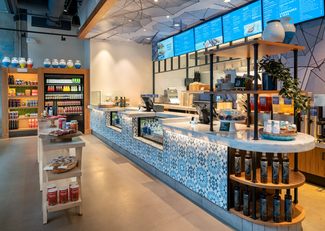
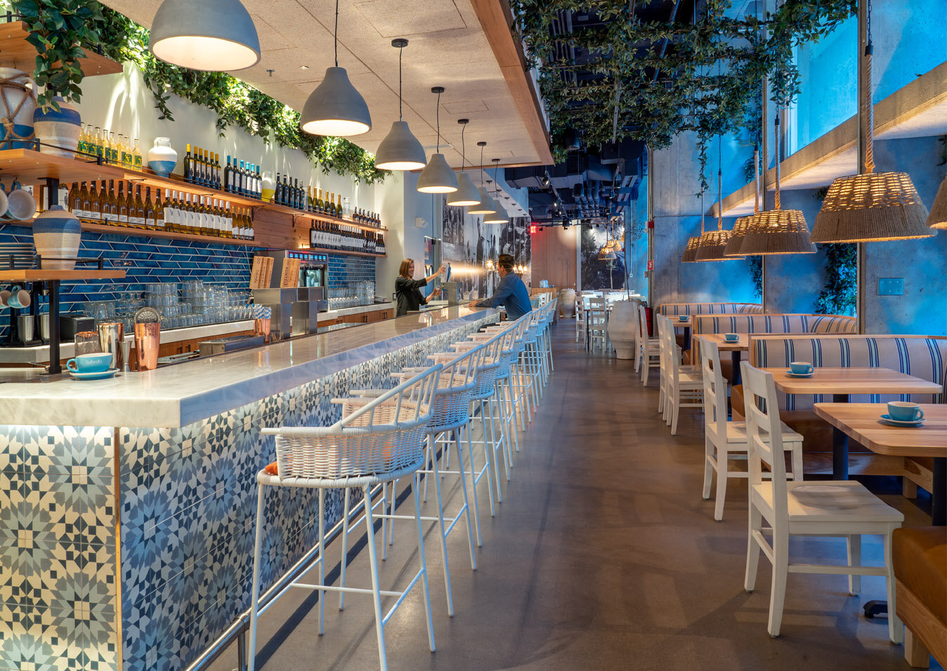
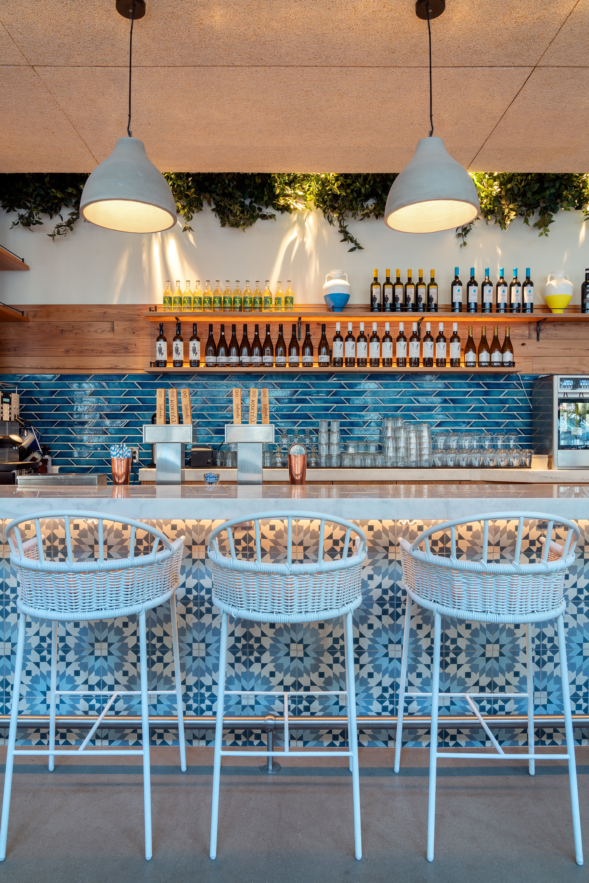
A CASE STUDY: SALONIKI GREEK

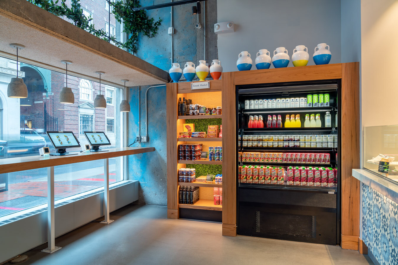
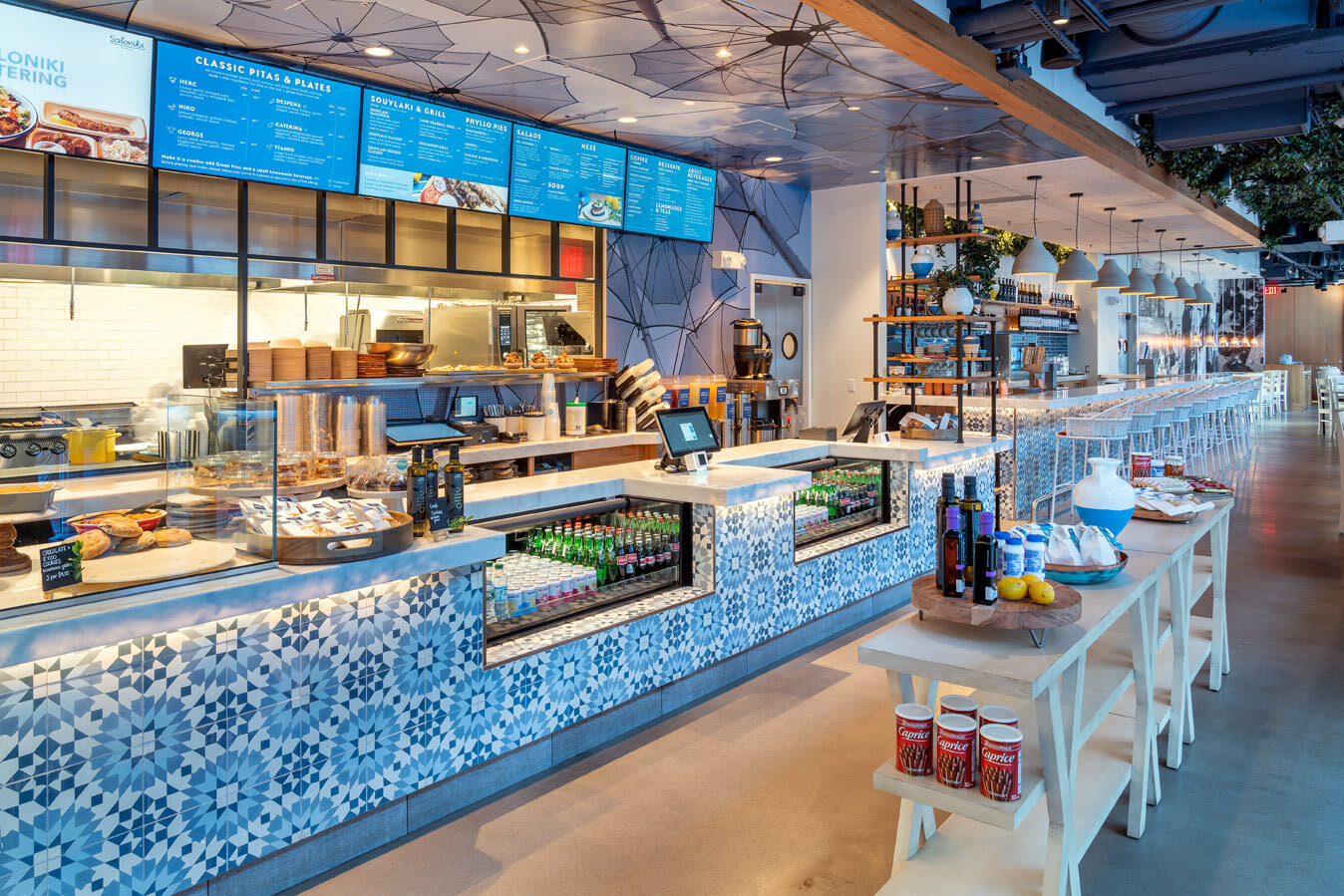
Did you know that the average consumer can spend an upwards of $5,000 or more per year on impulse purchases. Providing real estate within the brick and mortar restaurant dedicated to impulse purchasing is a great way to increase revenue of average ticket per transaction. There are endless statistics which all indicate that there's significant market share to be had in capitalizing on the impulse buy. Impulse buys have been proven successful in capturing additional unplanned sales by the customer. Saloniki is an example of taking that idea and implementing it tastefully in a restaurant environment. It was the desire of the owners to display and retail brands, flavors, and products that were classically Greek. We were tasked with creating and designing an effective retail area that reflected the design aesthetic that was uniquely Saloniki. What are important considerations when implementing retail and increasing impulse sales in restaurant design?

LOCATION

Location and vicinity of the point of sale (POS) is important. Placing the fix string adjacent or within arm’s reach of the queue line is a surefire way to increase sales. Product at the order counter adjacent to the POS. With customers contained in predetermined queue lines, retailers have a captive audience. Create layouts where the possibility of longer lengths of fixturing can be used.

FIXTURING

It is important to design the fixturing for specific products that are going to be sold. Doing so helps attract customers that buy through visual stimulation. Design tables and fixed string that complement the overarching design language in the restaurant. There are many options for fixture designs and – Freestanding units have infinite possibilities as far as design goes. There are dump bins that are typically used for small and sundry items. The checkout display are the units that stanchion or usher the queue line in a specific path. Countertop displays place the product at eye level and can be purposefully integrated into the POS counter design to create an effective display and avoid a cluttered appearance.

I SEE IT! I WANT IT!

Signs are a good way to boost impulse sales. There are various ways to implement signage to let patrons know that this is in fact for sale. Signage that is complementary to its surroundings draws attention to the product. Lighting can be used to spotlight product or product zones and project the desired items into the visual foreground. Do not be afraid to design tasteful displays for products throughout the dining establishment.

BEYOND POS

Now more than ever, there are endless ways that customers can order food products online. Many restaurants offer add-ons in the form of a dessert or gift cards through E-Retail.

Bar Design

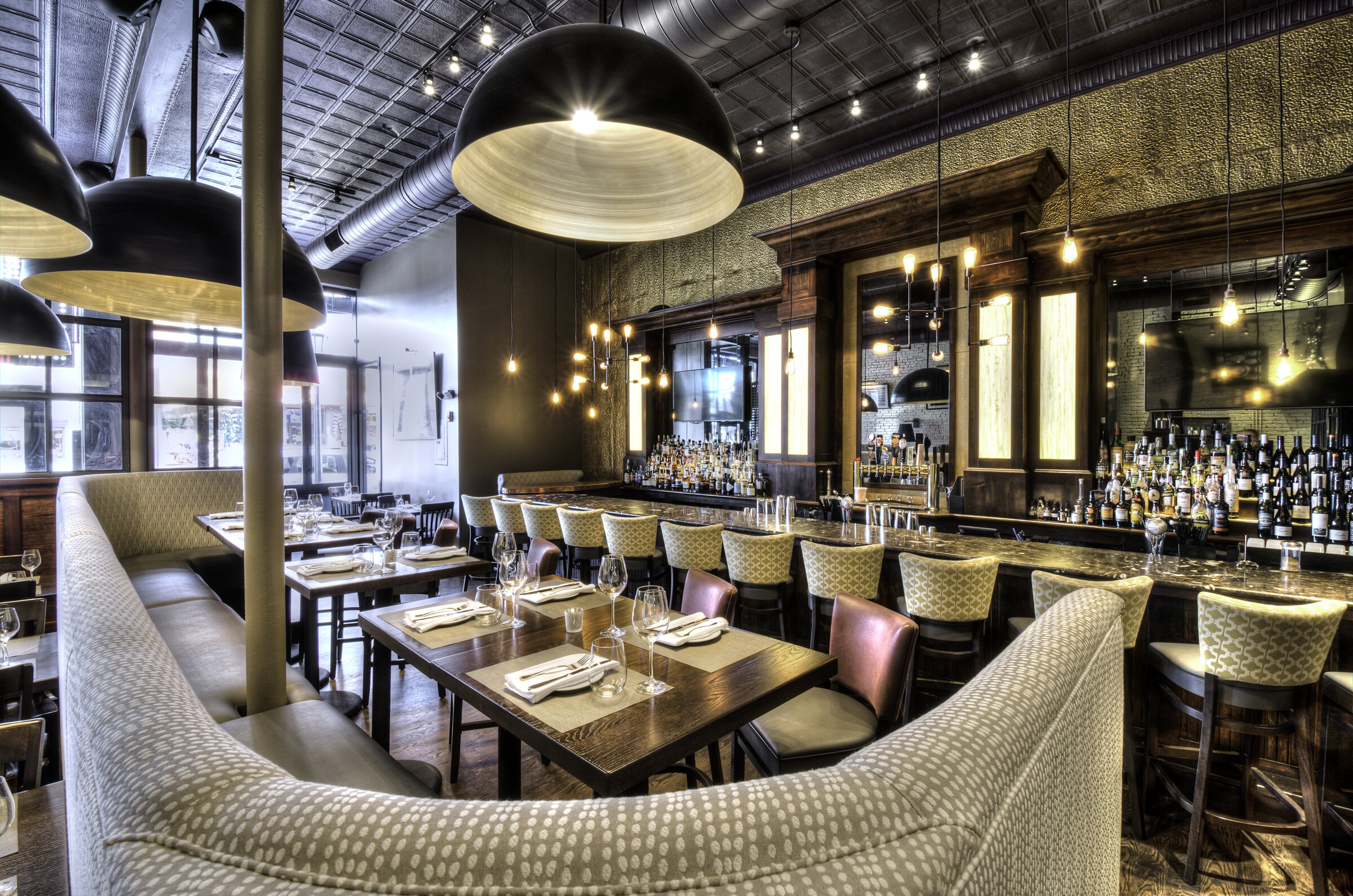
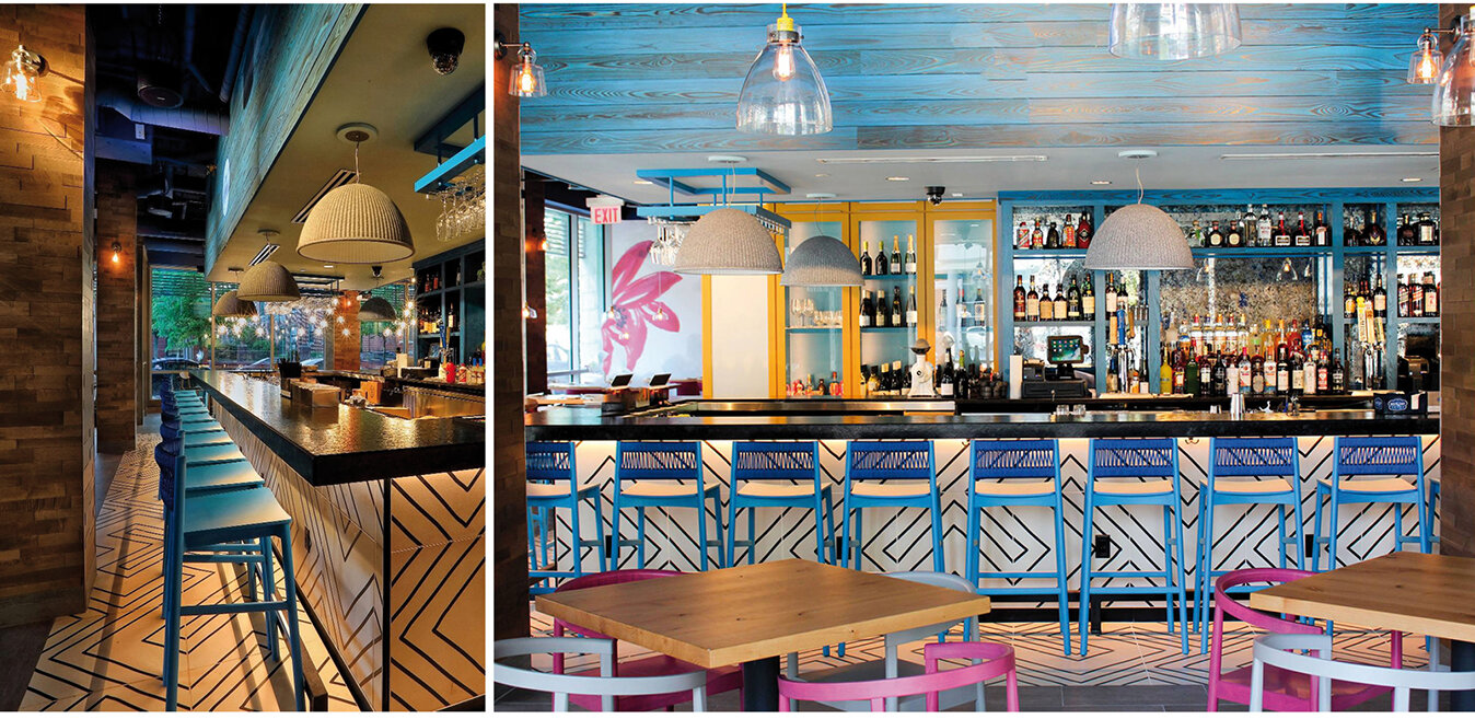
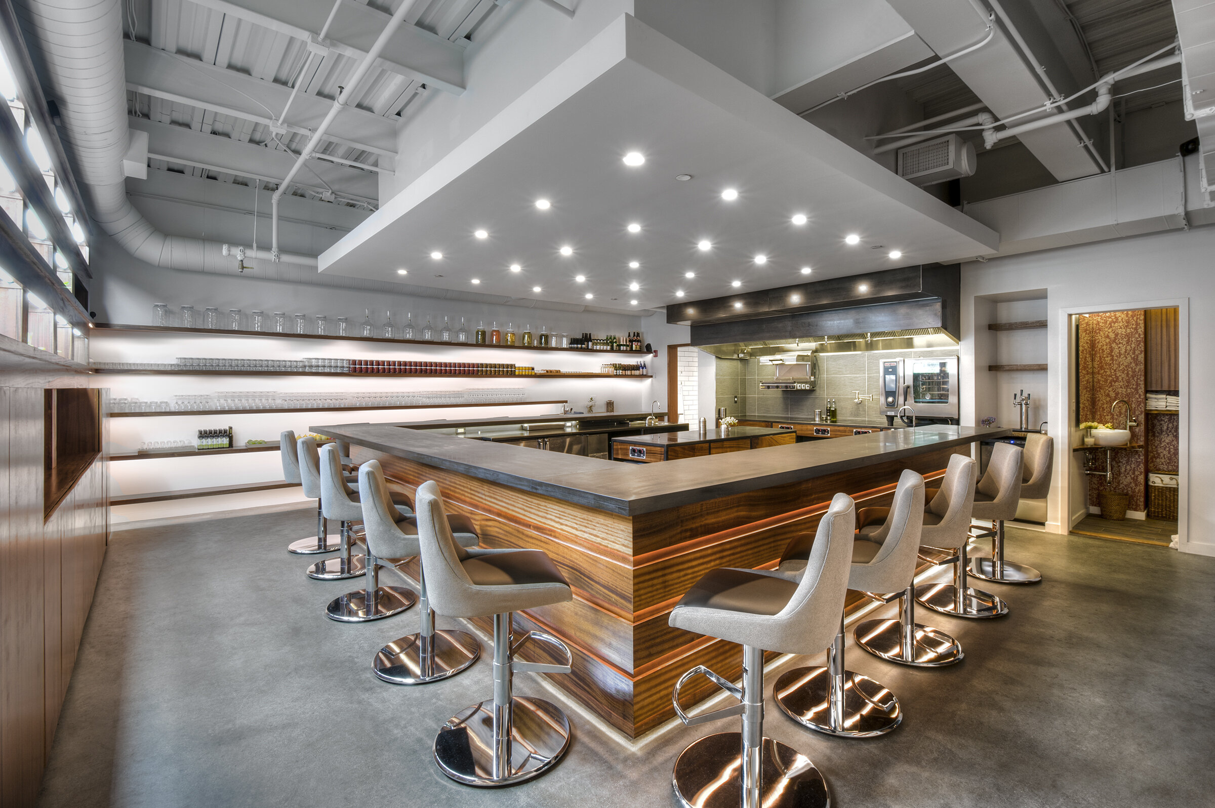
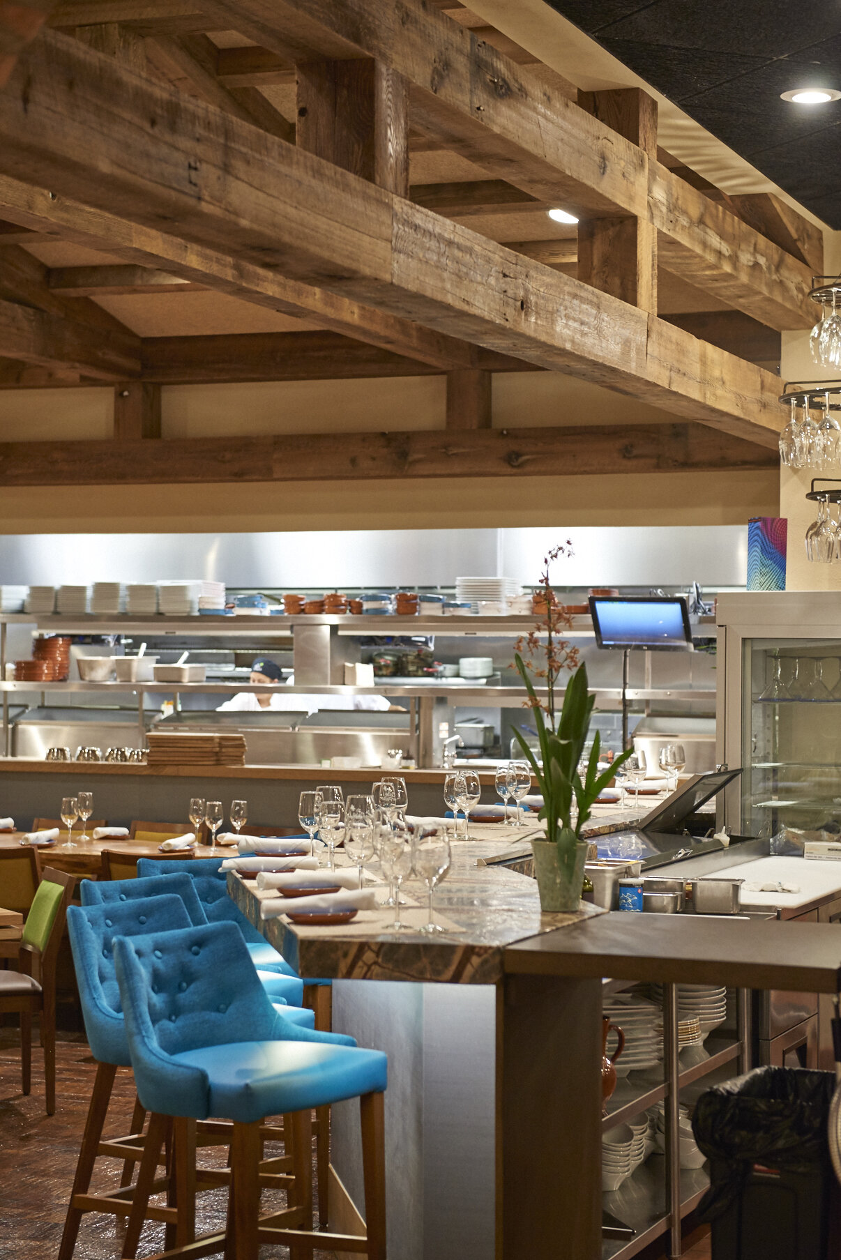
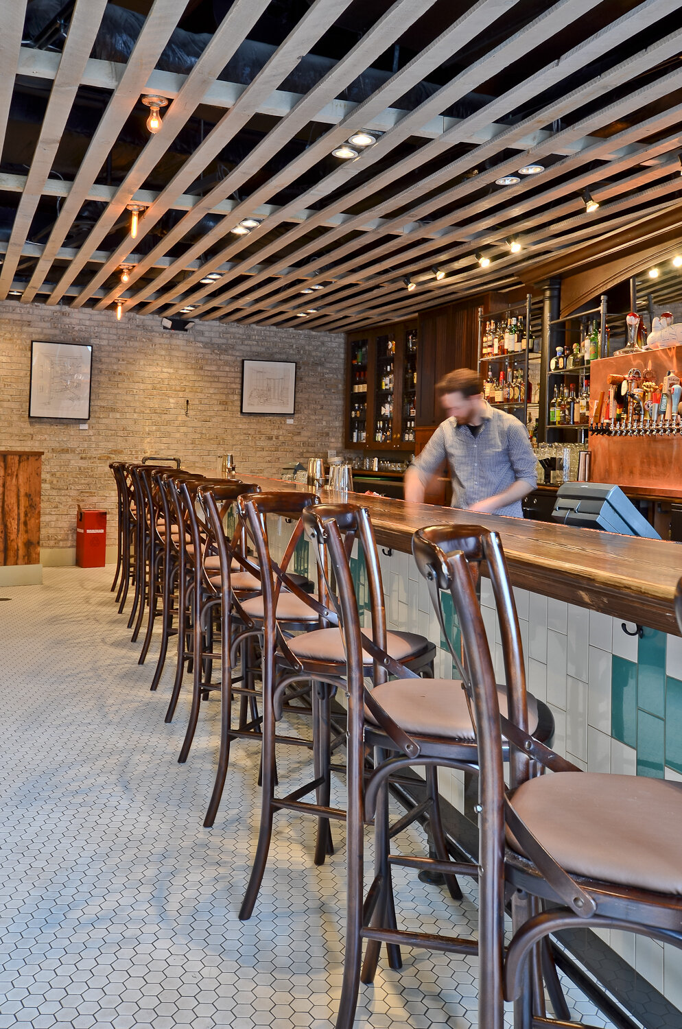
Do you love bars? We do! Our hospitality team got together for a roundtable discussion on what we often discuss with clients when we work with them to design their restaurant and bars. Below is a summary of things we think are important when designing a successful bar.

First and foremost! We want to know: What is the purpose of your bar? What do you want your bar to do?

These two questions can indicate other things to consider when starting out with a blank space. Bars often must be designed around the equipment that will be used and the number of people the bar will be serving. A work bar, for example, is meant for servicing the restaurant as a whole and may not serve as many seated people. This contrasts with a bar where guests might spend more time seated, enjoying drinks, appetizers or dinner, and chatting with each other or your bartenders. Understanding how you want your bar to work helps us determine a rough size of your bar and how much space needs to be dedicated to it.

Get with the program!

Along the same lines of how the bar will work is what is the function or program of the bar. Do you want to focus on liquor sales or food sales? Is the bar an experience or is the restaurant? What is your program – Does your bar & restaurant focus on a cocktail program or is liquor or craft beer the focus of what will be served? Do we need to design an elaborate bottle display, or would you prefer your mixed drinks shine, not your bottles? How many well stations should we consider in your design or does your bartender need space to create their own syrups and bitters? These functional questions help us decide if the bar should be a showstopper or one of utility and ensures the best design for your space.

Standing Room (only?)

We like to know what your intentions for the bar may be, so that we can plan for standing space behind the bar. Are seats important or is the bar more of a service counter for the restaurant and guests? A brewery or sports bar may want some seats at the bar, but may also be a service counter where people will line up behind the barstools to order and stand. If this is the case we like to plan for some open space behind the bar to allow guests to stand comfortably without disrupting those seated at the bar or dining space. If food isn’t the focus and the bar is the centerpiece we want to know that too! Planning for drink rails and other places to stand or sit, like with high top tables will ensure a comfortable experience for all patrons.

Babbo (6).jpg

Location, Location, Location!
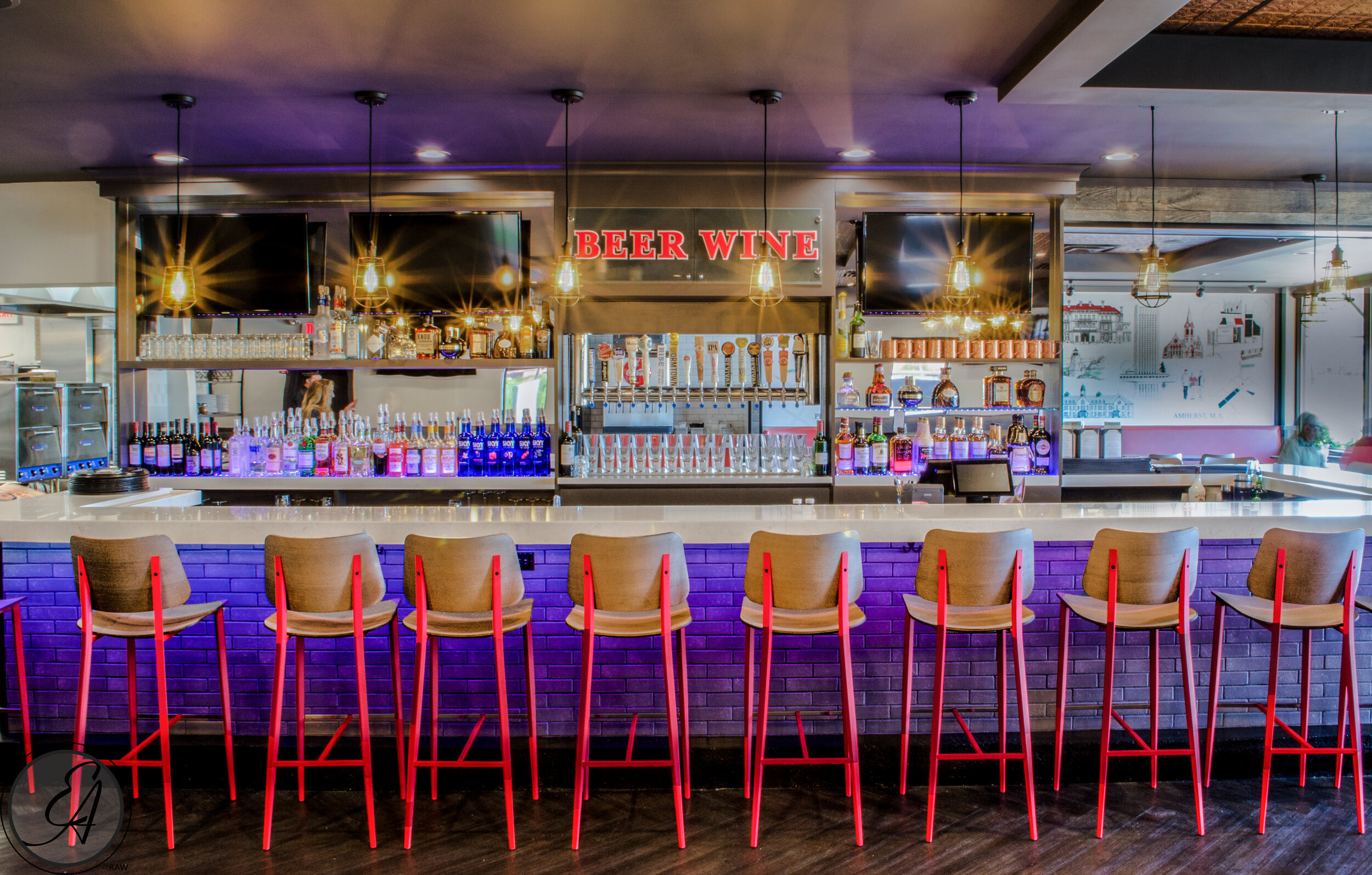
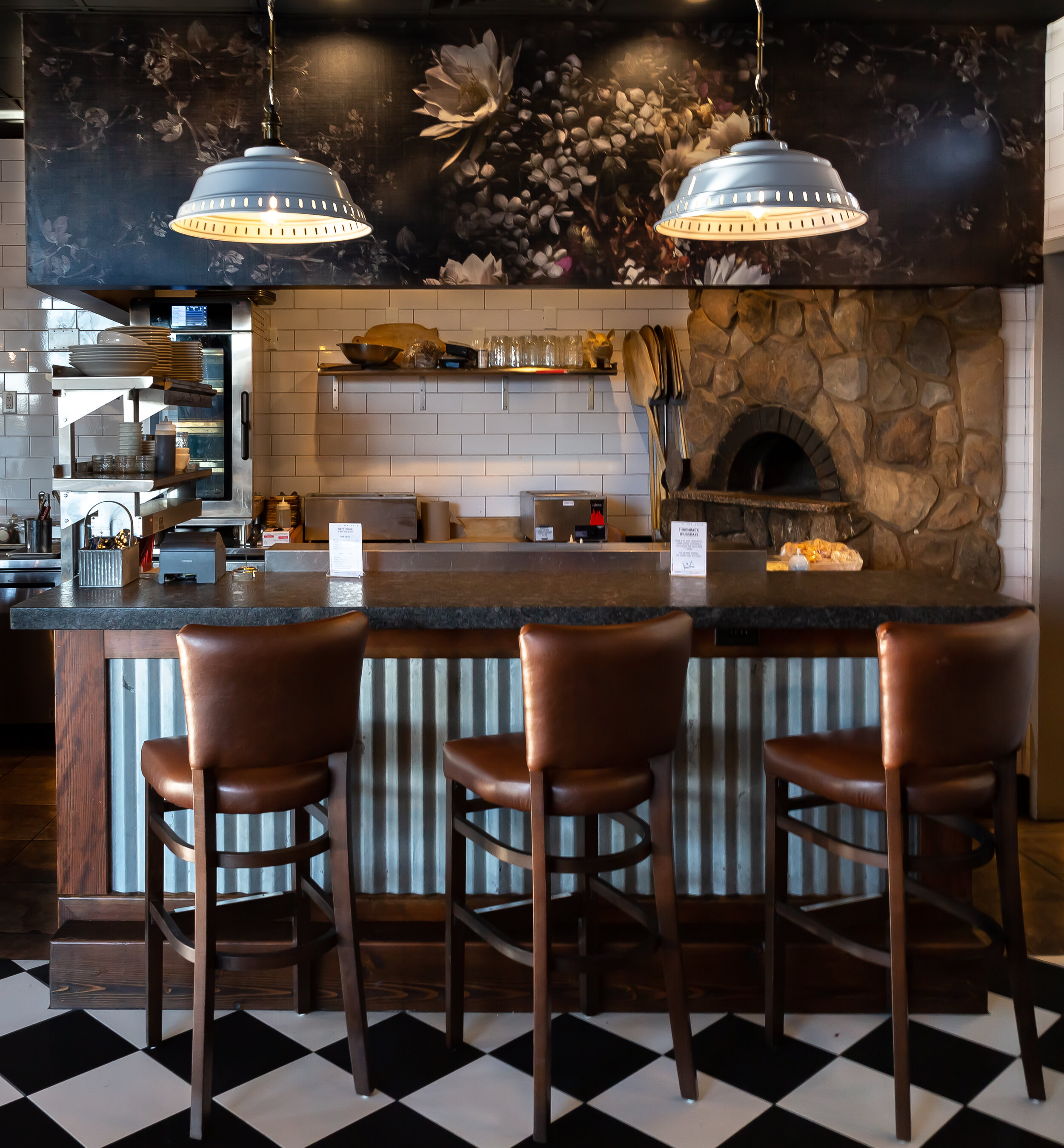
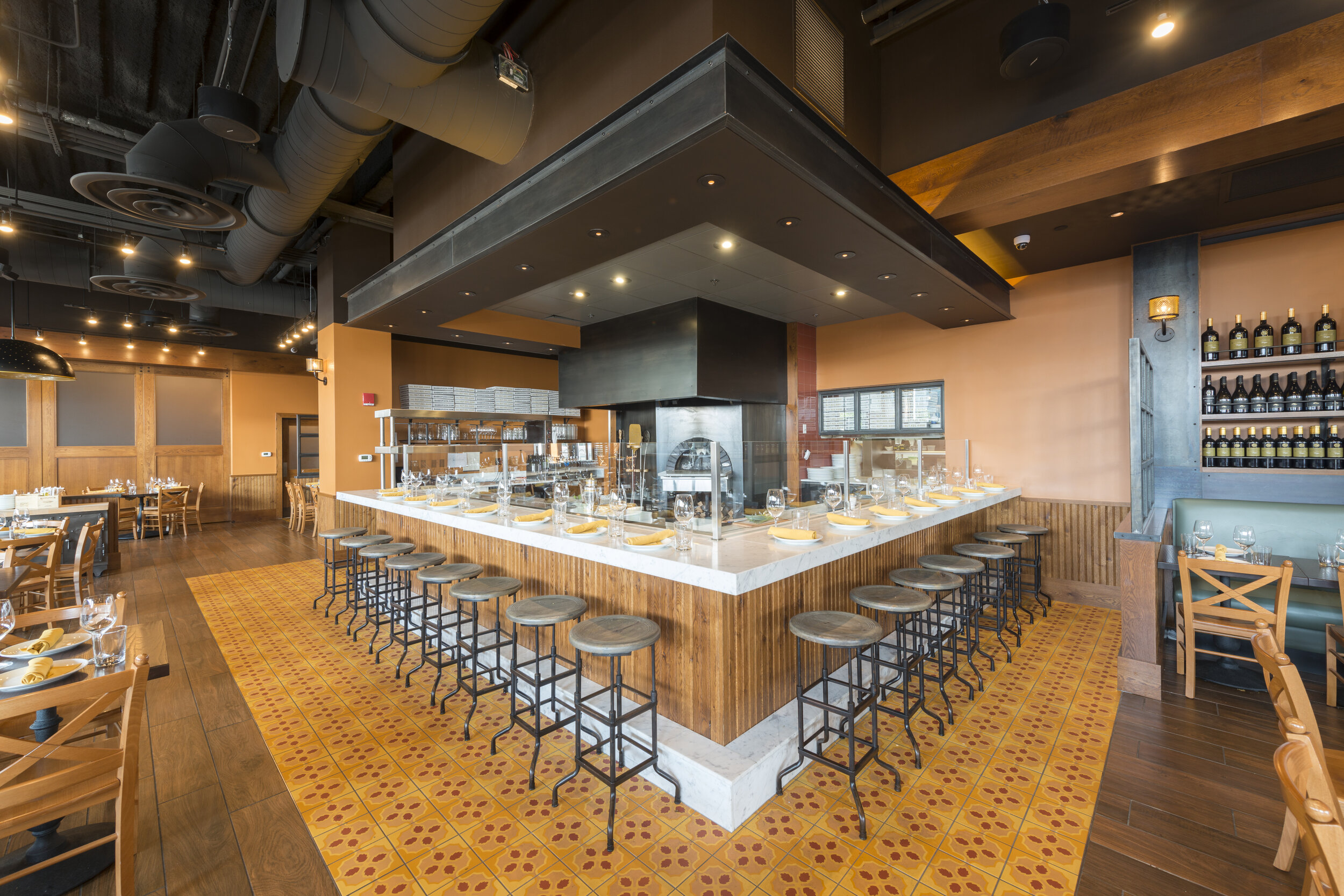
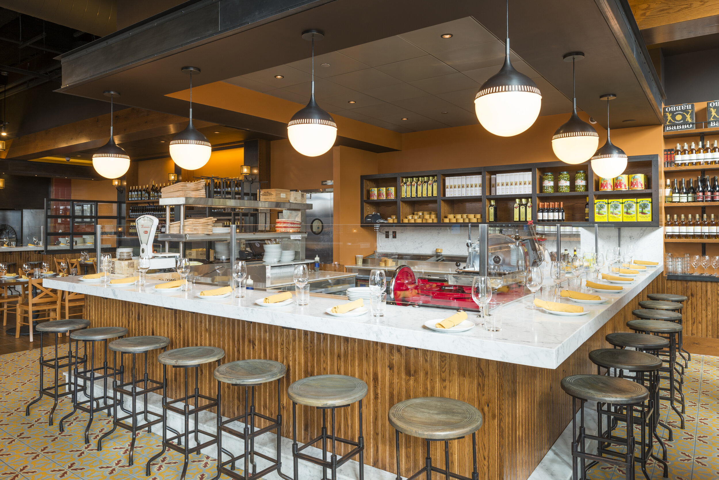
Bar location is important, and program and intent can help inform where to place your bar within the restaurant. If the bar stands alone it could be a racetrack in the middle of your restaurant and be seen in 360 degrees! Is there a pizza oven or another reason to have the bar connected to the back of house? Is the restaurant a small space that requires the bar be anchored to a wall? Or is it U shaped or does it need to be an L shape? People like bar corners, so planning for them can be important. Location matters in terms of how guests may use the bar, and if you already have some ideas on how you’d like it utilized we can work with you to ensure that your location is just right. Geographic location is also a good thing to consider. Is your restaurant in a suburb catering to families or is your restaurant in a city that caters to the after work or late night crowd? This could also effect the design, materials and layout of your bar.
Do you see the light!?

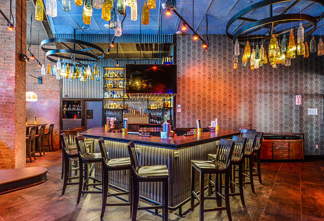
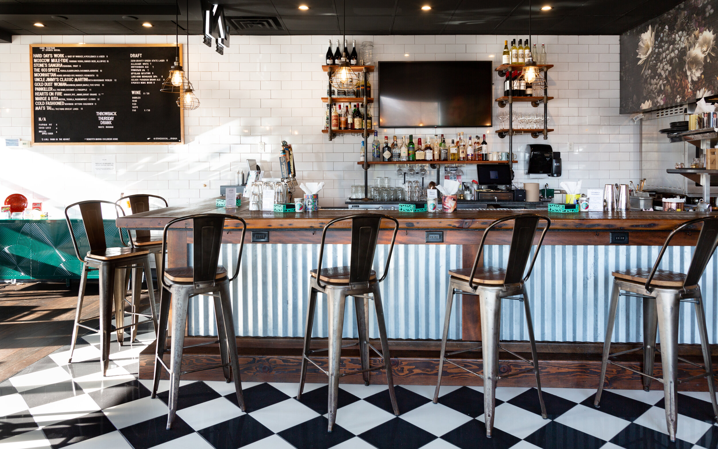
Once we have the above questions answered we like to plan for lighting. If bottle display is important how will they be lit so guests can see them? Do we need to include internally lit bottle steps? Is there a soffit or do we need to design something to display lights over your bar top? Something that we don’t always see but like to put into our drawings is under bar LED light strip lights. We work with clients to create stunning bar walls, and lighting those materials can make a huge difference in how the bar is perceived, especially in the evening! Under counter lighting also illuminates purse hooks and convenience outlets. Two under counter design elements we like to include in all of our drawings.

Take a seat!

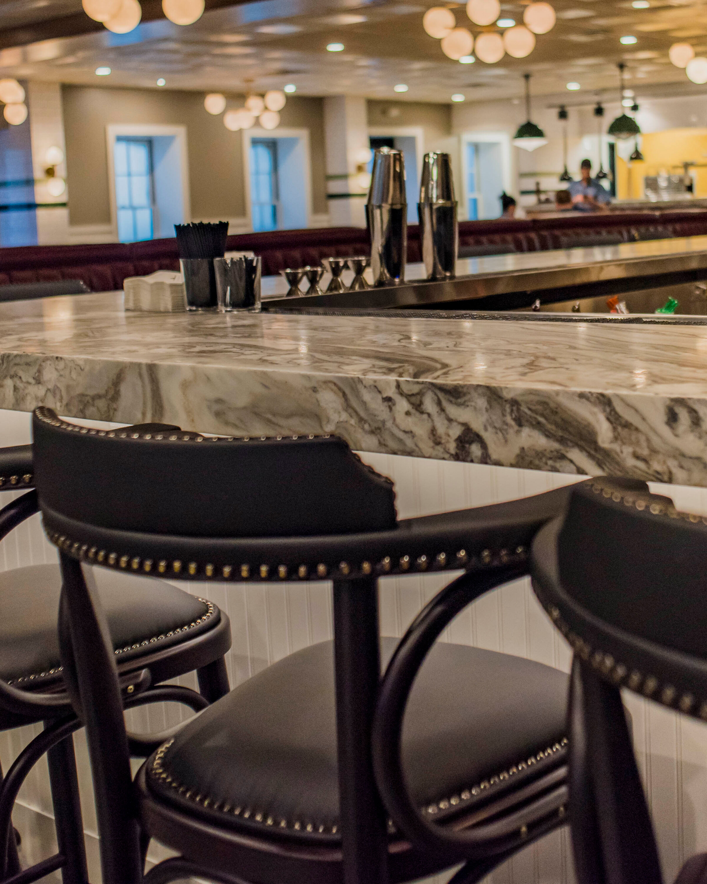
Barstool design matters! How heavy are those barstools? Will guests be able to pull them out from the bar or push them in when they leave? Nobody likes to throw their weight into moving furniture, especially after a couple of those delicious cocktails or craft beers you’re serving! Does the stool swivel? Will clothes or fingers get stuck in those mechanisms? They are fun, but are they practical? Are the seats hard and promote turnover or soft to ensure a long enjoyable seat at the bar? One thing we always keep in mind when discussing stools with our clients is bar seats = revenue! Often architects and designers will use a standard barstool CAD block or Revit model in their drawings. However, chair size should be shown in the drawings. Not only is the space between chairs important for guests’ personal space, but if a stool is wider or smaller that the drawing the correct number of barstools may not be accounted for properly. This could mean an increase or decrease in revenue for our clients. We like to ask our clients if they have an idea of how many people they want at their bar, so when we plan bar size we also account for the size of the stools.

Do you have access?

Bars are active spaces, so access panels are very important. If bartenders must pull equipment out from under the bar for maintenance, it can be difficult for them to move around the bar and complete other tasks. Understanding equipment and locations can help us design access panel locations that allow service to continue without disruption.

20191216_tavernoftales_0207.jpg

Put your feet up!

Foot rails are a must! For shorter people, a foot rail is handy to get into a seat. People will stand on them to order drinks if the bar is crowded, but leave their feet dangling while they are trying to enjoy a drink or food and they will be uncomfortable. This can also be said for drink rails and standing bar tables too. Everyone enjoys having a counter to lean on and a place to rest their foot. It can be disappointing when that extra step is expected, but not there.

Does your bar pass the tests?

Bars get a lot of use, so the durability and maintenance of materials are essential in creating a bar that will withstand wear and tear. That is why we often ask if materials pass the stiletto test, the red wine test, and the citrus test. Feet will hit the front of the bar wall, so materials that can withstand wet feet and kicking are important. We’ve seen beautiful, tufted leather bar walls that don’t last and end up ripped with the inside being exposed. Not a great look. For that reason, we often ask if materials will withstand the stiletto test. Likewise bar top materials should also be durable. Will the top withstand people sliding drinks along the surface? Will the material withstand red wine stains? Citrus is a delicious cocktail garnish but can cause materials to etch. We always work with our reps to ensure materials pass the tests!

 Always set the bar to these 2 standards!

1.       Proper Dimensions always mean a comfortable experience.

  • 42” high counter

  • At least a 12” overhang at the counter. Clearance is very important when designing a bar.

Waiting at bar (say for coffee) vs. seating (drinks and eating) can mean different overhang depths.

  • Abide by the 12” Rule! There should be 12” from the top of the dining surface to bottom of seat.

    Have you ever walked up or down stairs and suddenly tripped? We may not see a change in stair tread size or riser height, but our bodies will notice as soon as we trip. The same can be said for table and seat height. If you sit down and the dining surface is too high, it is noticeable and for the rest of your time seated you will feel uncomfortable. Ensure the right height and guests will dine in comfort!

2. There must be a drip rail at the back end of the counter.

This is where drink mats are often placed and where bartenders usually mix drinks. It is important that it is lined with a durable material that can withstand being wet for long periods of time and that it drains properly. 

Now that you know what we look for we hope we can help you design your next successful bar and restaurant!

Should You Build A Spec Suite at Your Office Building?

For building owners often there are questions surrounding spec suites. For those with the time and resources, building out a spec suite can make it easier to lease vacant space.

Throughout the nearly 25 years of experience in workplace design, we believe that they can be an excellent option for landlords.

In order to help you decide if a spec suite is the right decision for your property, we’ve put together this list of pros and cons that landlords should keep in mind when considering whether to pursue a spec suite in one of their spaces.

Pros

Make Smaller Suites Easier to Lease

As mentioned briefly above, the most obvious benefit of a spec suite is that they can be easier to lease than unfinished spaces.

Not only are they more appealing to the eye when they are toured (for the same reason that staged homes are easier to sell), but the lack of work required to finish the space makes these deals very appealing to smaller tenants. Completed space can attract tenants that are hesitant to put in the time to wait for a space to be completed and would prefer to move in quickly.

Avoiding an office build-out can save these tenants both time and upfront costs. Often, tenants under 5,000 sf are not in the market early enough to build out an entire space. Tenants of this size are also typically hesitant with out of pocket expenses for a build-out, which is becoming more and more expensive as tenant improvement funds from the landlord (TI) are not usually enough to cover the rising construction prices. 

This means spec suites are very popular with smaller tenants, and usually lease out much more quickly than non-spec suites and can also at times bring a small premium to the leased space.

186 Lincoln_03.jpg

Additionally, when prospective tenants are touring many locations, a memorable build out can make the decision easier. At McMahon Architects we work with building owners to design spaces to be thoughtful and interesting to attract prospective tenants. The right color on a painted partition and eye-catching staged furniture can appeal to the market and help the tenant invasion themselves using the space.

The spec suites designed by our talented team create flexible and economic build outs. This creating the right balance with a minimal number of built offices and conference facilities while leaving pre-planned space for additional offices and meeting spaces. This flexibility maximizes the landlord investment and provides a tenant with options once they move in.

MN04180111.jpg

Maintain Consistency

For landlords with multiple properties, spec suites can also be beneficial by providing economies of scale and standardized finishes. 

Rather than every space being different and requiring an ever-changing variety of light fixtures, curtains, paint and carpet our team creates building standard design solutions that can be used in endless combinations. This allows buildings to maintain a set of standards while still giving them the ability to create unique but consistent and compatible spaces. Pursuing multiple spec suites with a standardized palette can provide consistency across a building, campus or portfolio. Large-scale owners (REITs, investment funds, etc.) are especially likely to recognize the benefits of building standards used when building spec suites. 

This standard also allows for tenant growth. If they need to expand into an adjacent space the finishes are compatible and it can takes less TI dollars and time to get it in move in ready condition.

186 Lincoln_02.jpg

Cons

Financial Risk

Pursuing a spec suite can present a financial risk for the landlord. If the space will not lease once the spec suite has been completed, not only is the landlord missing out on income due to the vacancy but is not immediately seeing the return on the investment for the spec suite build cost.  

This is why it is important to design the most flexibility in a space for the spec suite market. With an extensive background in office design we understand the economics of commercial real estate, and have the experience to ‘right size’ the landlords investment.

MN04180112.jpg

Changing Office Trends

If designed poorly a spec suite could limit the potential uses of a space. Because a spec suite is essentially the landlord’s best guess as to what the average tenant in the market would like to have in a space, an experienced architect like McMahon Architects can work with the landlord to maximize the space’s attractiveness. 

Conclusion

As you can see, there are both benefits and potential risks associated with building out a spec suite. When done correctly, spec suites can be a great marketing tool to get tenants into your property quickly. It is important to have a trusted consultant like McMahon Architects to consider your specific space and property, your unique financial situation, and your market. The experience and knowledge provided by our talented team can help a landlord decide if creating a spec suite is the right choice for their property or properties.

12 Ways to Design Successful Spaces for Children

If you have kids or they’re on the horizon, a play room or space to call their own can be a great outlet for your child’s creative energy. Below are images of spaces we’ve designed for kids with a list of 12 ways to create successful areas for children in your home.

1. Ask the kids for their ideas

2. Create pieces that non-specifically encourage imagination 

3. Design for a few years older than they are, so the space can grow with them

4. Use complex colors AND basic colors

5. Use durable but comforting materials

6. Hide storage in clever ways

7. Avoid potential finger pinching doors or drawer closings 

8. Use the ceiling too!!

9. Hide a surprise - anything unexpected can promote creativity 

10. Makes comfortable places to read or play with the whole family

11. Have LOTS of windows. Research suggests that natural light boosts mood & cognitive skills

12. Think like a child & have fun with it!